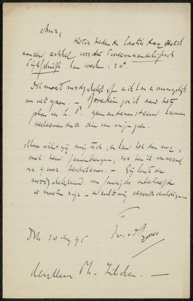
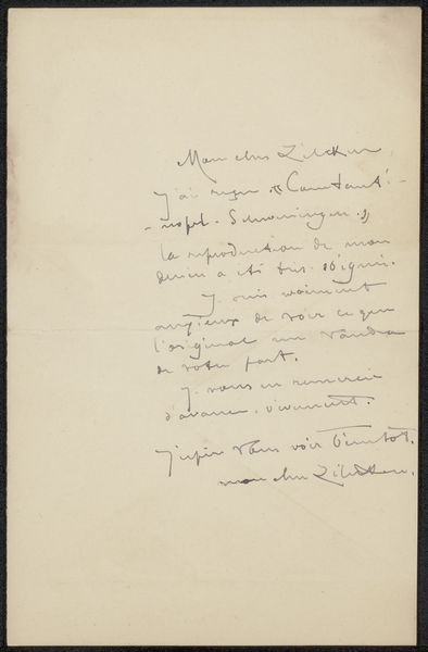
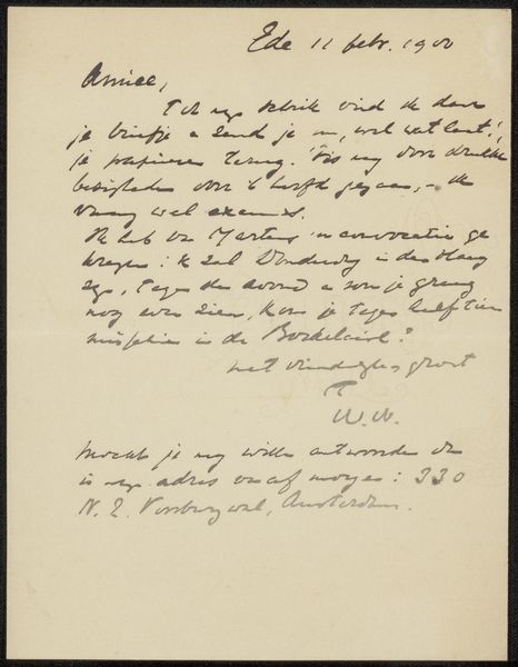
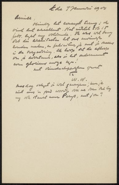
drawing, ink, pen
#
drawing
#
pen drawing
#
ink
#
intimism
#
pen
Copyright: Rijks Museum: Open Domain
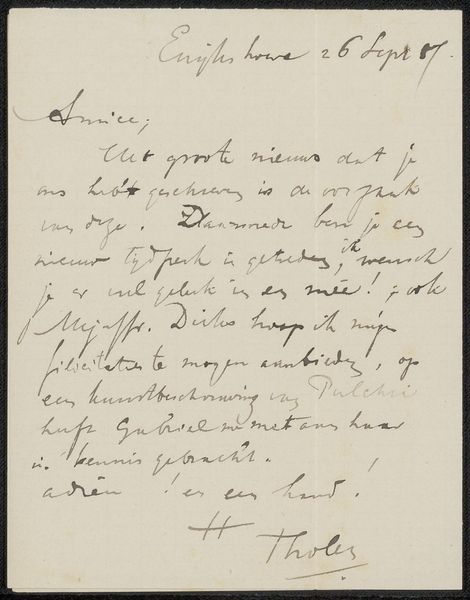
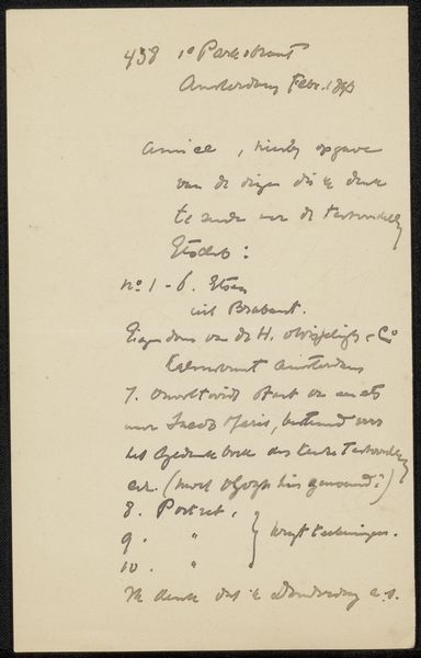
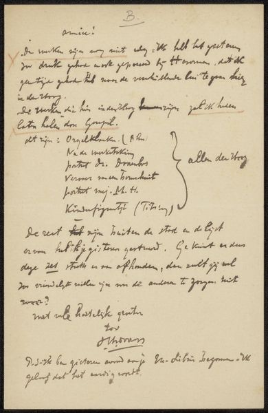
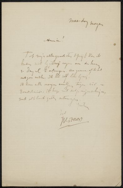
Curator: This delicate ink drawing, “Brief aan Philip Zilcken,” possibly from 1893, is by the Dutch artist Willem Witsen and is now part of the Rijksmuseum's collection. What strikes you initially? Editor: Immediately, it's the intimacy. The scale is small, inviting a close, almost secretive viewing. The pale paper and faded ink add to this sense of hushed, personal correspondence. Curator: Exactly. Intimacy is a key characteristic of this work and links to Intimism, an artistic theme associated with Witsen. It emphasizes the handmade quality and the immediate social circle it occupies. The material choice—pen and ink—suggests accessibility and the quick capture of thought. These letters served as a form of networking and community-building in the art world at the time. Editor: Visually, the text itself becomes the composition. The varying pressure of the pen creates a dance of light and dark across the surface. Notice how Witsen's handwriting possesses an almost calligraphic quality? The slight slant of the lines, the varied spaces between words – these all contribute to an overall sense of flow. Curator: Absolutely, and beyond the aesthetic, the very act of handwriting signifies labor and time invested. It embodies Witsen's own hand, mind, and personal relationships – his artistic capital if you will. The content mentions Brabant, portraits, and other artists like Jacob Maris – all details that reveal his social circle and professional preoccupations. These specifics offer insight into the workings of the art market and the personal connections behind artistic production. Editor: True. Yet, looking beyond the context, I find beauty in the visual rhythms, the organic forms created by the penned words. It stands alone as a balanced design, a testament to Witsen's eye, almost apart from the textual meaning it conveys. Curator: Perhaps we see two sides of the same coin, don’t we? Both material and form come together to highlight Witsen's artistry and shed light on the artistic world he lived in. Editor: Indeed. It leaves you wondering about the personal tone, hoping one day to decipher the letter and discover Witsen’s intended message, both personally and professionally.
Comments
No comments
Be the first to comment and join the conversation on the ultimate creative platform.
More like this