drawing, pencil
#
drawing
#
amateur sketch
#
impressionism
#
pen sketch
#
pencil sketch
#
incomplete sketchy
#
landscape
#
personal sketchbook
#
ink drawing experimentation
#
pen-ink sketch
#
pencil
#
sketchbook drawing
#
sketchbook art
#
realism
#
initial sketch
Copyright: Rijks Museum: Open Domain
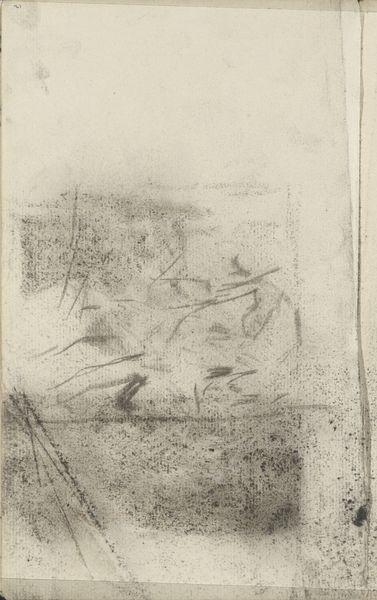
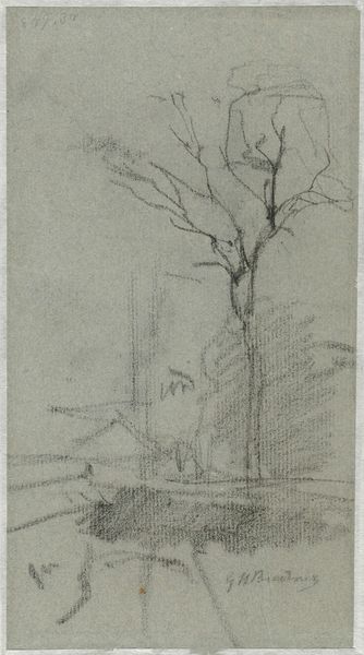
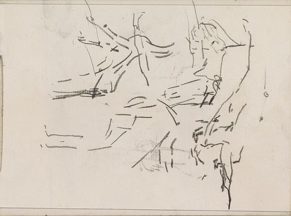
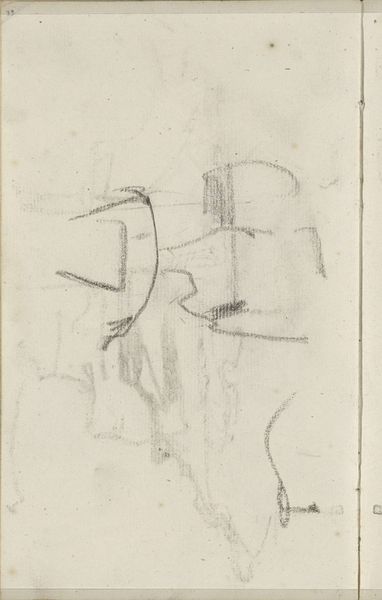
Editor: We're looking at "Wolkenlucht," a drawing by Anton Mauve, probably created sometime between 1848 and 1888. It’s currently housed in the Rijksmuseum. The rapid strokes give the drawing a fleeting, almost dreamlike quality. What strikes you about this work? Curator: Immediately, the contrast of the dense, almost violent, marks on the left juxtaposed with the lighter, more airy forms on the right draws the eye. Note the interplay of positive and negative space, particularly how the suggestion of form is often more compelling than a fully realized figure. It demands careful observation to resolve the composition. What do you make of that dynamic? Editor: I see that contrast, almost like a storm front moving across the sky. The forms on the right—clouds maybe?—feel much lighter and free. Curator: Precisely. Mauve's hand, here, translates the dynamism of natural forms onto paper. He doesn't depict; rather, he alludes to volume, movement, and atmosphere through the varying pressure and direction of his marks. Are these clouds or trees, for instance? Or perhaps something else entirely. The imprecision is vital. Editor: That’s a good point. I hadn’t thought about how ambiguous the forms actually are. It almost feels unfinished. Curator: Indeed. That sense of the "unfinished" becomes critical. Incomplete form implies process, inviting the viewer to complete the image with their own perceptions, generating meaning beyond a simple depiction. Is there an element in the work that interests you in that regard? Editor: Definitely the marks on the left side. The darkness pulls you in, but it’s also the hardest area to decipher. Curator: Its density creates a ground from which those ambiguous forms emerge, emphasizing their lightness and ethereality. The artist exploits tonal contrast and structural ambiguity to full effect. It’s not so much about _what_ is represented, but _how_ it is represented. Editor: So, it’s more about the visual relationships and techniques than any specific subject matter. Curator: Exactly. We can explore the interplay between intention and gesture. Do you feel this adds to, or subtracts from, your initial sense of it as “dreamlike”? Editor: Definitely adds to it. I see now that the sketchiness is very intentional. I had assumed it was simply incomplete. Thank you. Curator: A fruitful misunderstanding, leading to a deeper encounter with the work!
Comments
No comments
Be the first to comment and join the conversation on the ultimate creative platform.
More like this