drawing, graphic-art, ornament, paper, typography
#
drawing
#
graphic-art
#
ornament
#
art-nouveau
#
pattern
#
paper
#
typography
#
organic pattern
#
line
#
pattern repetition
Dimensions: height 75 mm, width 206 mm
Copyright: Rijks Museum: Open Domain
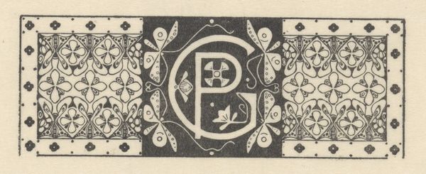
Mathieu Lauweriks designed this letterhead for the architects K. de Bazel sometime in the early 20th century. It's a striking example of the Dutch Art Nouveau movement, known as Nieuwe Kunst, characterized by its organic motifs and emphasis on craftsmanship. This letterhead isn't just a practical design; it’s a statement about the architects' values. The stylized floral patterns reflect a broader cultural interest in nature and a rejection of industrial mass production. The emphasis on craft—evident in the mention of decorative painting, sculpture, ceramics, and more—harkens back to the medieval guild system, a model that some artists and designers at the time hoped to revive as an alternative to capitalist modes of production. We can learn more about the history of Dutch design, and the socio-political ideas behind movements such as Nieuwe Kunst, through period publications, manifestos, and institutional records, as well as biographies of key artists. The meaning of this letterhead is thus contingent on its historical and cultural context.
Comments
No comments
Be the first to comment and join the conversation on the ultimate creative platform.
More like this