drawing, paper, pencil, architecture
#
drawing
#
paper
#
geometric
#
pencil
#
architecture
#
realism
Copyright: Rijks Museum: Open Domain
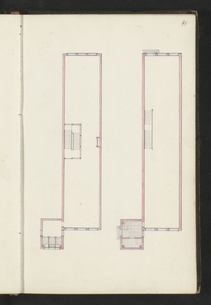
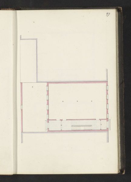
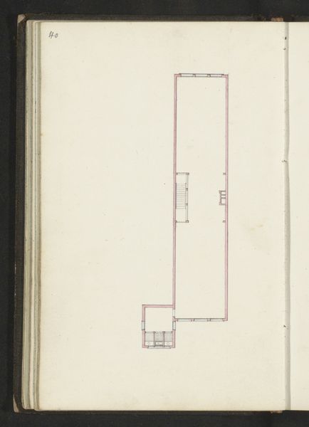
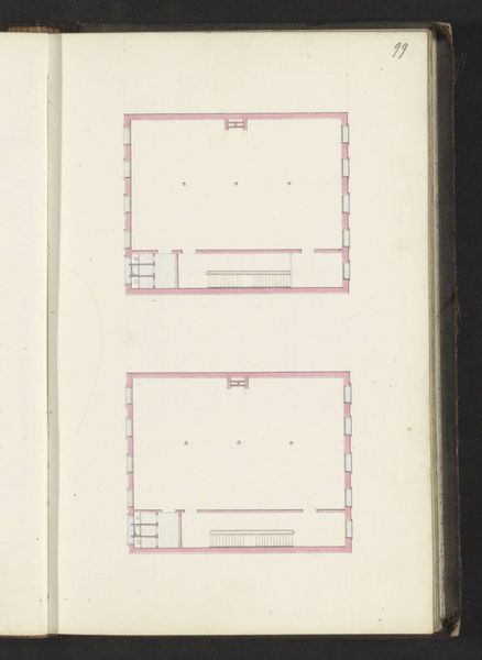
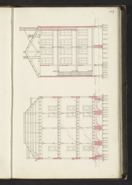
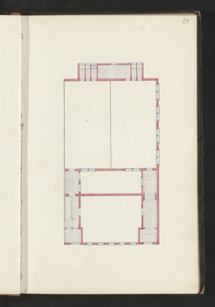
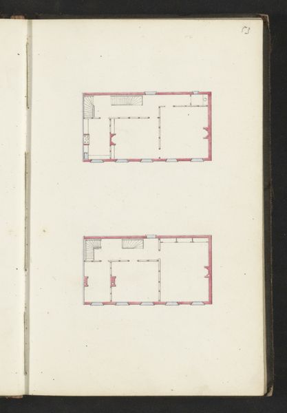
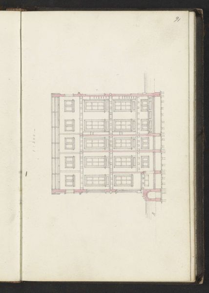
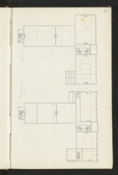
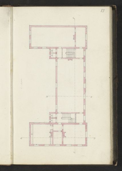
Editor: This is "Fundering," a drawing in pencil on paper by Willem Springer Jr., created around 1864. At first glance, it appears to be a floor plan of a building, meticulously rendered. The precision is captivating, but I am unsure what it says beyond just technical skill. What strikes you most about this piece? Curator: The linear structure dominates. Consider how Springer has articulated space through line and geometric form alone. The pink and gray shades contribute little as colour, but effectively articulate boundaries between inside and outside or above and below, wouldn’t you agree? Editor: Yes, I see what you mean. The interplay of the geometric forms is what gives the piece its…energy, maybe? The pink does add an extra layer of depth, I hadn't thought about it much before you said that, though it is fairly faint. Is the medium important? Curator: The deliberate choice of pencil on paper underscores the formal essence of architectural planning. Think about how a pencil forces meticulous lines, while paper demands precision in execution, reinforcing the work’s core subject: geometric order. Is this structure inviting? Editor: To be honest, it does feel a little cold and stark; though clean. Maybe "inviting" isn't quite right. Perhaps it suggests a world where everything has a specific, designed, purpose? I can imagine other ways in which Springer's "Fundering" achieves order from an aesthetic point of view, beyond what I initially understood from its surface. Curator: Indeed. Its strength lies precisely in how it reveals the underlying formal grammar of architectural space through subtle manipulation of geometric form. Now, can you look at another plan without thinking of Springer's design choices?
Comments
No comments
Be the first to comment and join the conversation on the ultimate creative platform.
More like this