drawing, graphic-art, paper, typography, ink
#
drawing
#
graphic-art
#
medieval
#
paper
#
typography
#
ink
#
geometric
#
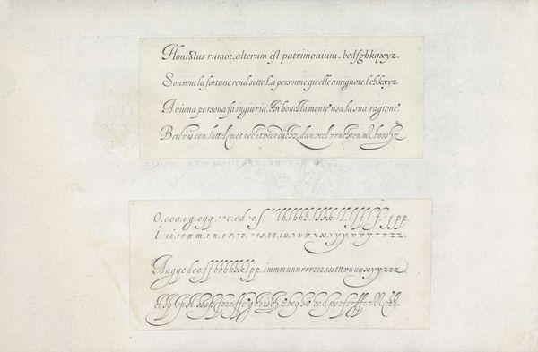
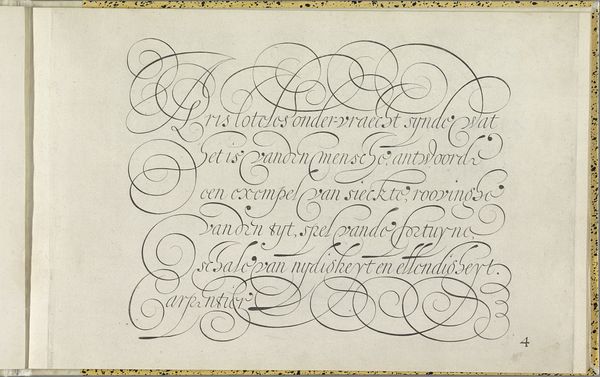
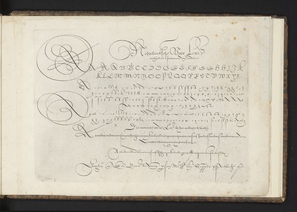
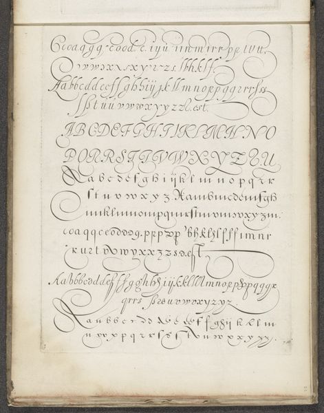
calligraphy
Dimensions: height 196 mm, width 300 mm
Copyright: Rijks Museum: Open Domain
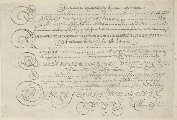
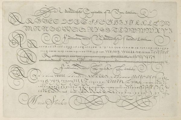
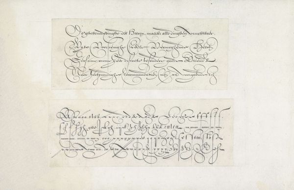
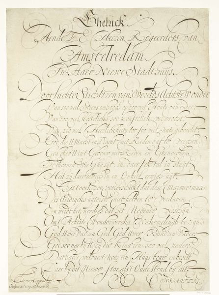
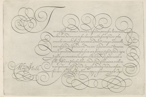
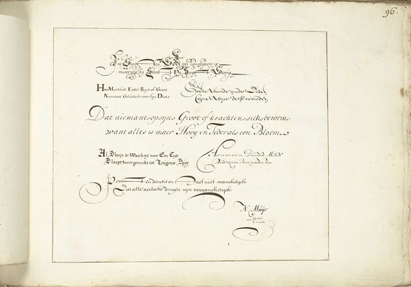
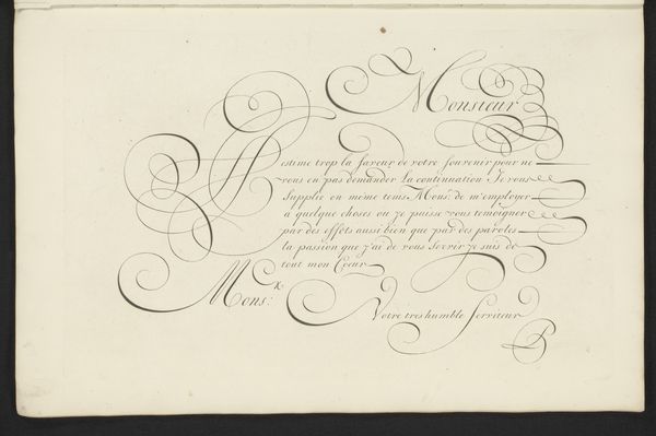
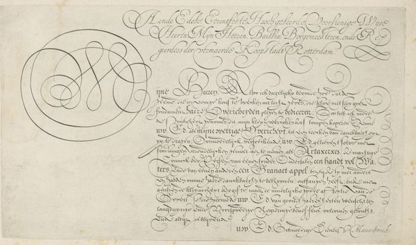
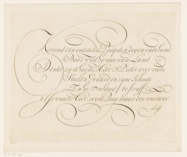
This is a page of calligraphy, made by Hans Strick sometime around 1600 in the Netherlands. It presents examples of Italian and Spanish lettering styles. At this time, handwriting was more than just a practical skill. The ability to produce elegant script was associated with status, education, and refinement. Manuals like this one served as guides, helping students and aspiring clerks to master fashionable scripts. Through careful study, one could improve their social standing. It’s fascinating to consider how something as seemingly simple as handwriting could be bound up with social mobility. By studying these scripts, and the contexts in which they were used, we can learn a lot about the values and aspirations of people in the 17th century. We can research how certain forms of writing became associated with certain regions or social groups. Such resources help us understand art as something deeply embedded in its time.
Comments
No comments
Be the first to comment and join the conversation on the ultimate creative platform.
More like this