#
neo-pop
Copyright: Modern Artists: Artvee
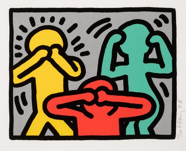
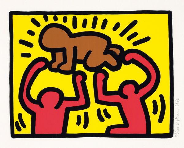
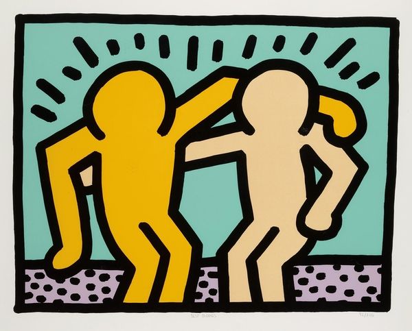
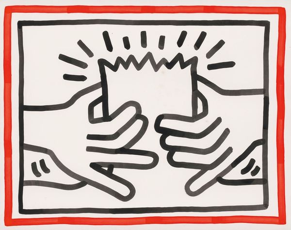
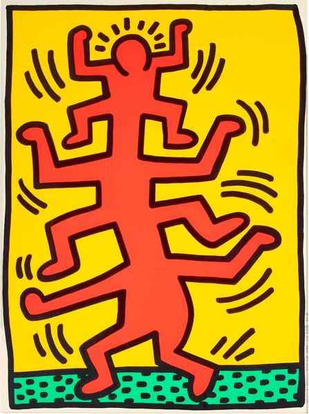
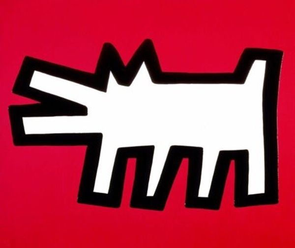
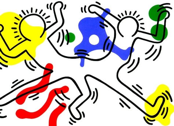
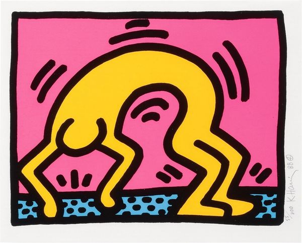
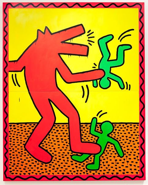
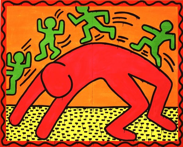
Curator: Keith Haring's "Icons; one plate" from 1990, realized using acrylic paint, strikes me immediately with its bold graphic quality. What do you make of it? Editor: My first thought is the raw materiality, the flatness almost belies the fact this is paint. How was it applied, was it screen-printed to get such solid colours? The bright yellow screams Pop Art, mass produced, and accessible. Curator: It’s fascinating how Haring distills the human figure to pure line and form. The red figure on the bright yellow surface with the radiating lines seems almost hieroglyphic, communicating directly without narrative, or even realism. Notice the figure: the stylized wings, and the X that stands for the face; the line operates here as meaning. Editor: Absolutely. And what did the production look like? Considering Haring’s commitment to accessible art, where did he source the pigments? And that perfect opacity must mean several layers of pigment—it belies the gesture that his line implies. It appears both handmade, and industrially produced, what’s that contradiction about? Curator: Consider the semiotics—the use of simple shapes to suggest complex ideas. The winged figure could represent freedom, spirituality, or even warning. It reads almost as an attempt to create an archetypal image, but stripped back to essential shapes. Its visual language, a bold statement rendered in a very clear style. Editor: The simplification of form serves accessibility, doesn’t it? In street art it bypasses elitist definitions of 'high' art, because its function isn’t symbolic value, its production values allow art to be shared, to be available on streets as stickers. How many copies of this plate exist, and where were they consumed, I wonder. Curator: You make a fair point: there's a universal accessibility in Haring’s visual language that’s distinctively powerful in how it cuts across social strata, despite his engagement with an art-market-based Pop Art scene. His lexicon became so distinct that any image gains automatic reading within a particular context. Editor: A crucial tension for Haring, certainly: bridging art production and art world dynamics with his utopian ideal for accessible public art. Considering the context of his death, what meanings can we extract today, with the focus now being not only on how he paints, but for whom? Curator: A pertinent reflection – certainly it brings forth new perspectives to a well known and admired artwork! Editor: Absolutely! A worthy avenue for further reflection for our visitors too.
Comments
No comments
Be the first to comment and join the conversation on the ultimate creative platform.
