Curatorial notes
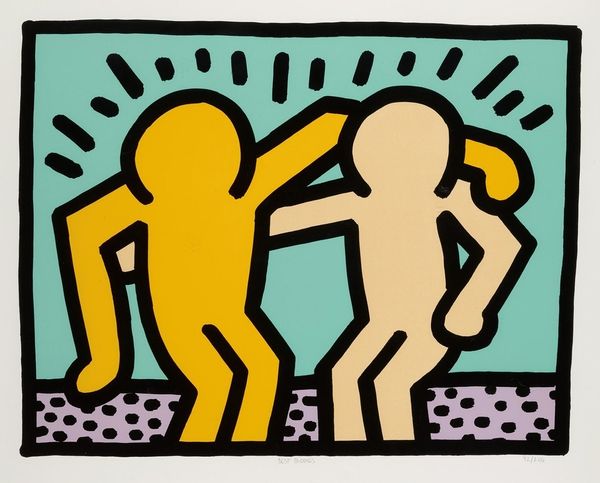
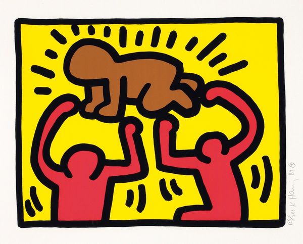
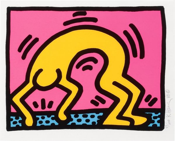
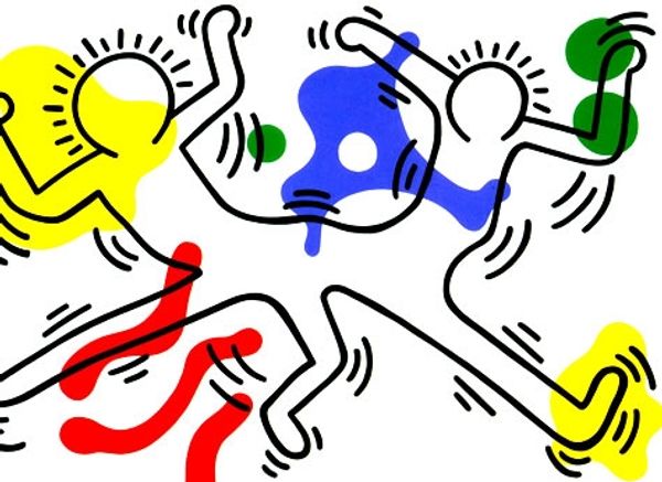
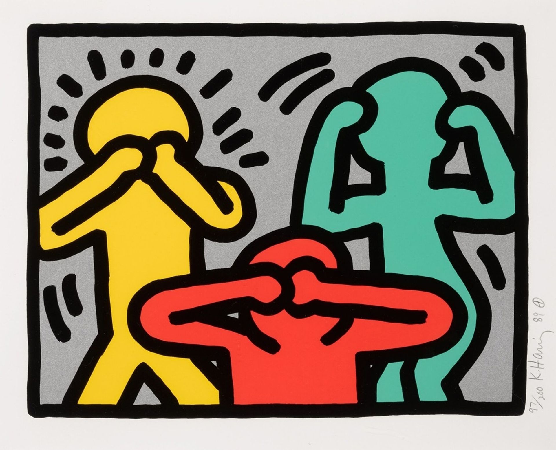
Editor: So, here we have Keith Haring's "Pop Shop III" from 1989, a screenprint in that iconic pop art style. The bold lines and bright colors are immediately striking. I'm really drawn to how Haring uses such a simple visual vocabulary to create a piece that feels so dynamic. What do you see in this work? Curator: Focusing purely on its formal properties, the immediate observation is the interplay of figure and ground. Note how the figures, delineated by thick, unwavering black lines, establish a distinct separation from the gray background. The chromatic scheme is constrained, limited to a triadic palette of red, yellow, and teal. How do these choices affect the work, do you think? Editor: Well, the limited palette creates unity, but the colors themselves are so saturated they give it energy and prevent it from feeling too flat, right? Curator: Precisely. Moreover, the composition’s strength relies on the rhythmic repetition of simple, geometric forms. These aren’t portraits in any traditional sense; they are graphic representations distilled to their essential components. The power emanates from its inherent structure. Do you notice anything else that contributes to its internal cohesiveness? Editor: I'd say the negative space around the figures – those small, almost radiating lines – contribute to a sense of movement, even though nothing is actually moving. They almost create a visual echo. Curator: An astute observation. Consider now the black lines used to create this sensation of the subject which is enhanced by its serial printing. Together the sum effect lends a dynamic, almost kinetic visual experience. That creates what seems to be both an intriguing depth and interesting comment about art, popular culture, and design of its time. Editor: It's interesting how analyzing the basic components can change my understanding of such a visually accessible piece. Curator: Indeed, focusing on the intrinsic elements offers an entry point beyond the surface level.