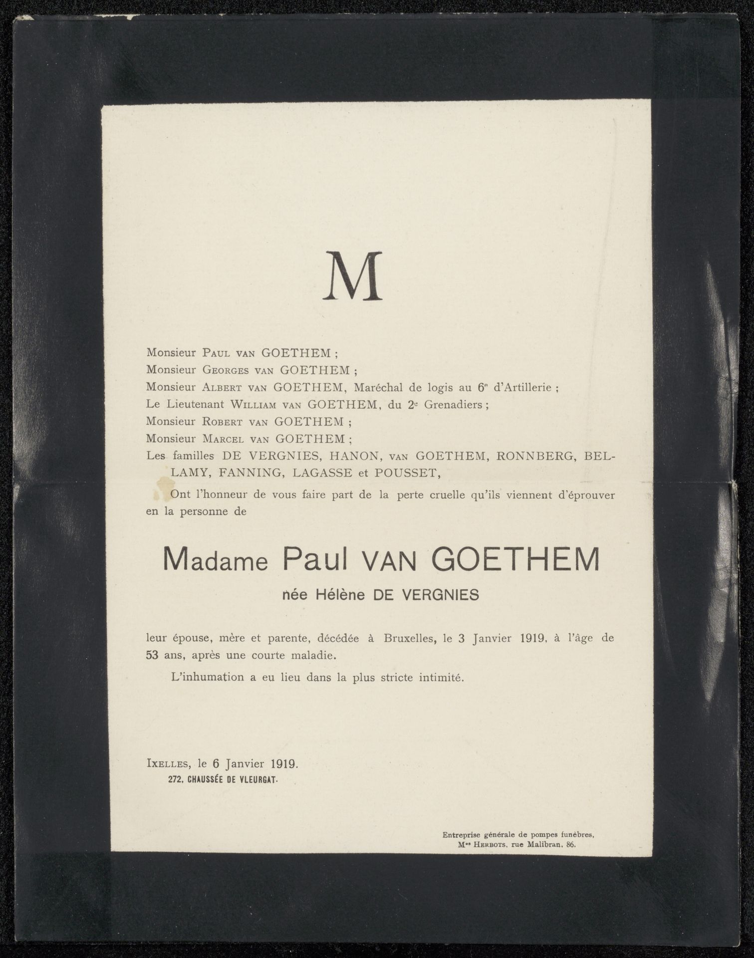
Possibly 1919
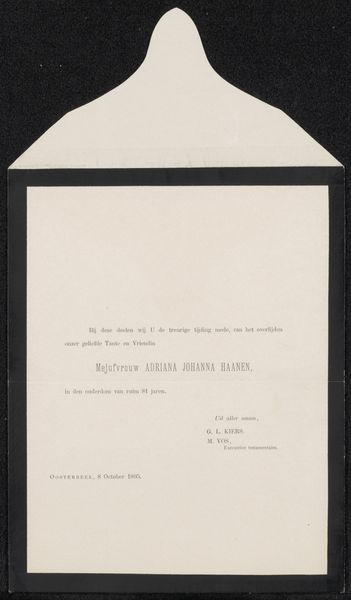
Overlijdensbericht aan Philip Zilcken en Henriette Wilhelmina van Baak
Anonymous
@anonymousLocation
RijksmuseumListen to curator's interpretation
Curatorial notes
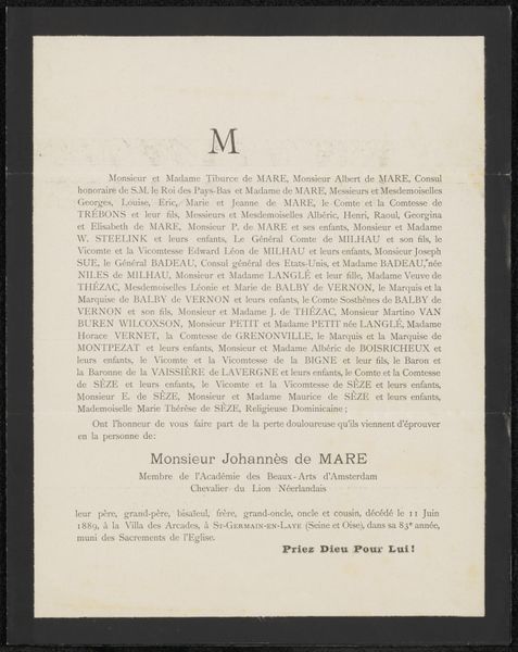
This printed announcement, created in 1919, commemorates Madame Paul Van Goethem. The most prominent visual element is the large, centered initial "M." This initial, standing alone, takes on a symbolic weight. Throughout history, initials have served as markers of identity, lineage, and memory, appearing on objects and buildings. Here, the "M" for "Madame" is both a personal identifier and a signifier of social status. Consider how the use of initials appears on ancient Roman monuments or Renaissance portraits, each time carrying a weight of history and personal identity. In psychoanalytic terms, the initial might also tap into our subconscious desire for order and meaning. The isolated letter, devoid of its full context, invites us to fill in the gaps, to project our own associations onto it. The "M" becomes a focal point for collective grief. The use of typography isn't just informative; it's emotionally charged. This simple letter has evolved through time, yet it continues to resonate with viewers on a deep, subconscious level.