Copyright: CC0 1.0
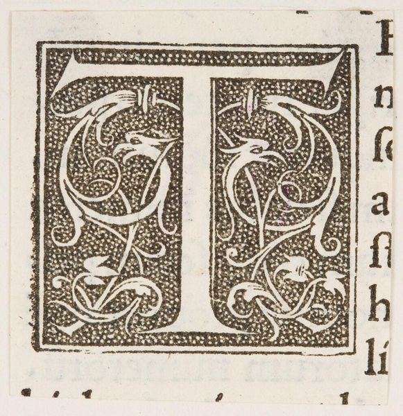
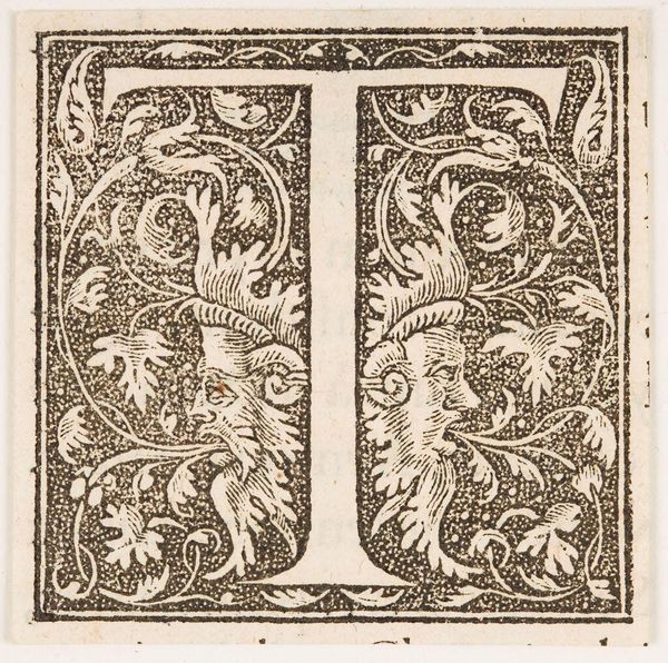
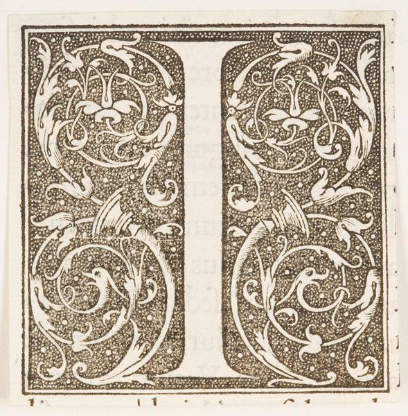
Editor: Here we have "Capital T" by an anonymous artist. The letter itself is quite striking. What can you tell me about the composition? Curator: Note the dynamic interplay of positive and negative space. The boldness of the letterform contrasts with the delicate, organic ornamentation. The anonymous artist masterfully balances these elements, creating visual tension. The stippled background also adds texture. Editor: I see what you mean about the stippling. It creates a nice contrast with the smooth lines of the letter. So, the artist is playing with texture and contrast to create a visually compelling piece. Thanks! Curator: Indeed. A fine example of form dictating function and beauty.
Comments
No comments
Be the first to comment and join the conversation on the ultimate creative platform.
More like this