print, paper, engraving
#
pale palette
#
dutch-golden-age
#
ink paper printed
# print
#
old engraving style
#
woodcut effect
#
landscape
#
paper
#
linocut print
#
engraving
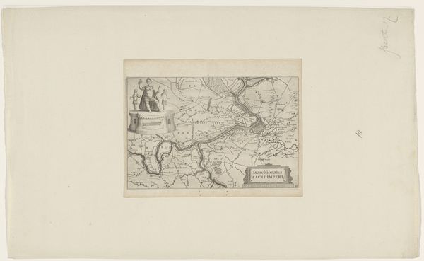
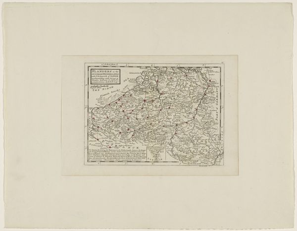
Dimensions: height 185 mm, width 255 mm
Copyright: Rijks Museum: Open Domain
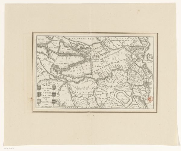
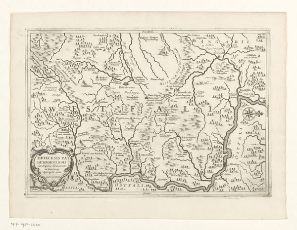
Curator: This is the "Kaart van het graafschap Vlaanderen," or "Map of the County of Flanders," dating from around 1673 to 1676, made by Pieter van der Keere. It's a fascinating engraving. Editor: It's incredibly detailed, especially considering the limitations of the printmaking process at the time. It gives an impression of incredible labor and patience. It's all so meticulously rendered; look at that line work! Curator: Absolutely. And while the aesthetics are compelling, this map is also a valuable historical artifact. Consider what it represented: power, control, knowledge, and even claims over land and resources during a period of intense political maneuvering and colonial expansion. Mapping was far from neutral; it was a political act. Editor: I see what you mean. But the artistry is still paramount. The engraver’s use of line to denote terrain, the lettering style... all these formal decisions create a very pleasing visual experience. Curator: True, but how do those visual choices contribute to the overall message? Who was this map intended for? What was the impact on those who were mapped versus those doing the mapping? We should really try to explore whose perspectives are centered—and decentered—in this representation. Editor: Perhaps. The pale palette, limited as it might have been, almost creates a sense of faded glory or antique charm now. This engraving allows us to grasp the landscape, the county’s form as a whole. Curator: It makes me think about how cartography often omits the human cost. Flanders experienced frequent conflicts; control shifted back and forth between major European powers. Maps like these provided a visual shorthand, simplifying complex geopolitical situations but also sanitizing the realities on the ground for everyday people. Editor: It's striking how functional becomes beautiful through composition and detail. The balance between utility and beauty is deftly struck. Curator: For me, engaging with its complex colonial history and social impact makes its aesthetic choices even more resonant. Editor: I appreciate your historical perspective on what is simply a beautiful object.
Comments
No comments
Be the first to comment and join the conversation on the ultimate creative platform.
More like this