drawing, print, ink, pen, engraving
#
drawing
#
pen drawing
# print
#
pen illustration
#
pen sketch
#
landscape
#
11_renaissance
#
ink
#
geometric
#
pen
#
engraving
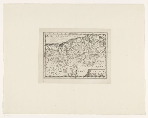
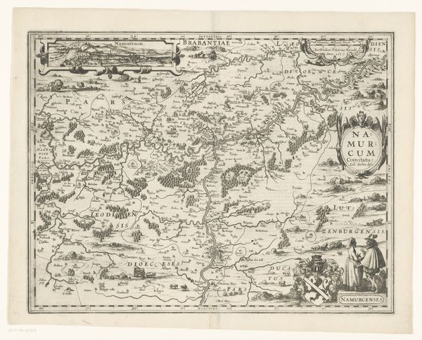
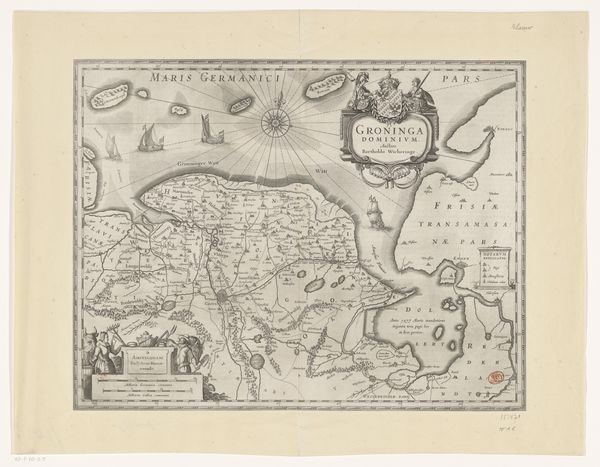
Dimensions: height 238 mm, width 316 mm
Copyright: Rijks Museum: Open Domain
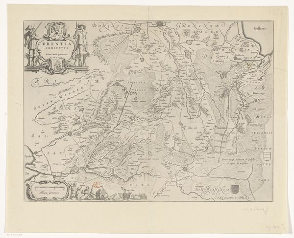
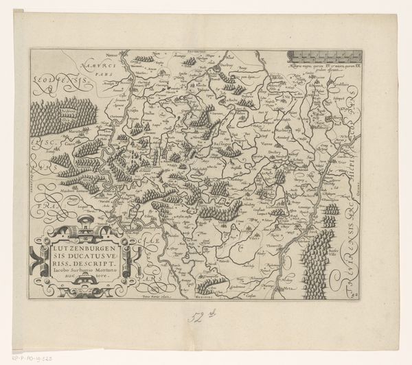
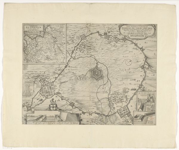
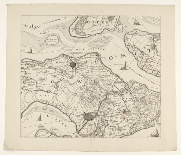
Editor: Here we have Pieter van der Keere's "Kaart van het graafschap Namen," a map of the County of Namur, created sometime between 1612 and 1648. It's rendered in ink, as a print, showing detailed landscapes and geographic divisions. I find the elaborate script really striking. How do you interpret the visual language of this piece, its symbols and design? Curator: The map teems with a desire for order, but also reflects a very specific worldview. Cartography in this era was as much about power and control as it was about geographic accuracy. Do you see the visual hierarchy at play here? The prominent placement of the county's name, the way settlements are depicted relative to forests and waterways… Editor: I do notice how the 'important' settlements are labeled in larger, bolder text. So, these aren’t just neutral depictions. Curator: Exactly. Each element carries symbolic weight, contributing to a narrative about the land and its governance. The ornate script speaks to the educated elite who would have used and understood this map. Even the compass rose, often included, is more than just a direction finder; it’s a statement of navigational authority and, by extension, European dominance in that age. Think of the emotional investment in claiming and naming territories! Editor: It’s fascinating to consider this as more than just a simple map. The "voice" of the mapmaker speaks loudly, doesn't it? Curator: Precisely! Maps become cultural artifacts imbued with intention and ideology. Looking at it this way, we're reading a visual argument as much as reading geographical data. A great reminder that every image, no matter how practical it seems, has a point of view embedded within. Editor: That really changes how I'll look at maps going forward. It's not just 'what's there,' but also 'who says so' and 'why'.
Comments
No comments
Be the first to comment and join the conversation on the ultimate creative platform.
More like this