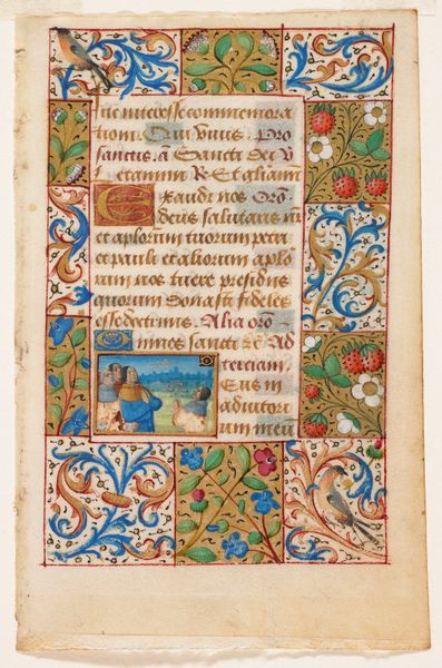
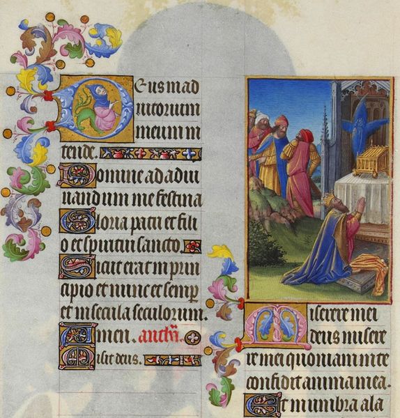
Illuminated Page from a French Book of Hours c. 1505 - 1510
0:00
0:00
tempera, painting, print, paper, ink
#
medieval
#
narrative-art
#
tempera
#
painting
# print
#
figuration
#
paper
#
personal sketchbook
#
ink
#
coloured pencil
#
france
#
genre-painting
#
northern-renaissance
#
miniature
Dimensions: 5 3/4 x 3 5/8 in. (14.61 x 9.21 cm) (image)
Copyright: Public Domain
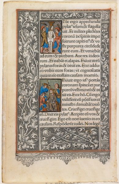
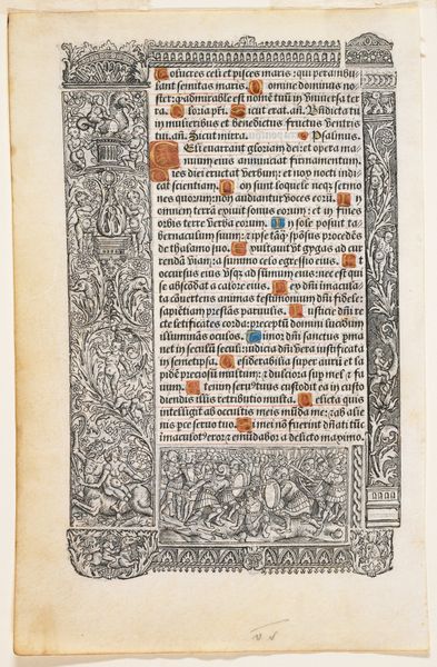
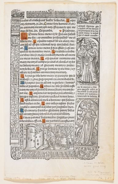
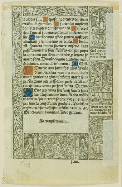
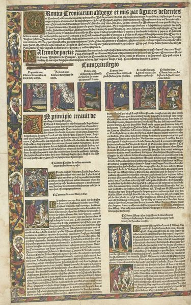
This illuminated page from a French Book of Hours was made around 1500 by Thielman Kerver, using ink and tempera on vellum. Vellum, a parchment made from animal skin, was prepared through laborious scraping, stretching, and chalking. The page is densely packed with text, images, and decorative elements, each requiring meticulous execution. Note the figures, rendered with fine brushstrokes, and the intricate borders populated with floral and figural motifs. Kerver likely used stencils, stamps, and punches to create the repeating designs. The vibrant colors, achieved with pigments ground from minerals and plants, add to the page's visual richness. Consider the immense labor involved in producing such a manuscript: from preparing the vellum to mixing the inks and paints, to the painstaking work of calligraphy and illumination. This book was a luxury object, reflecting the wealth and status of its owner and the social conditions of its production. The incredible detailing blurs the lines between the craft and fine arts.
Comments
minneapolisinstituteofart over 2 years ago
⋮
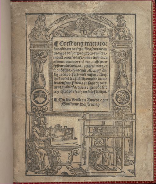
Thielman Kerver was a highly successful Parisian publisher, whose business continued for generations within his family. In the early 16th century, he published several Books of Hours that conceptually followed the segmented border format used in the manuscript shown nearby. For him, the advantage lay in making small metal printing plates that could be recombined and reused. The plates were attached to wooden blocks to make them the same height as the type for the text. The pictorial metalcuts are so densely overpainted that it is hard to see that the images are printed. Kerver inked his types in both red and black in emulation of manuscript text. The main type font, however, is very different from French manuscripts of a few years earlier and signals a shift in orientation from medieval monasticism to renaissance humanism. The text is meant for the knowledgeable, for many of the words are severely abbreviated.
Join the conversation
Join millions of artists and users on Artera today and experience the ultimate creative platform.
More like this