graphic-art, print, typography, engraving
#
graphic-art
#
script typography
#
hand-lettering
#
baroque
# print
#
old engraving style
#
hand drawn type
#
hand lettering
#
word art
#
typography
#
hand-drawn typeface
#
pen-ink sketch
#
pen work
#
coloring book page
#
engraving
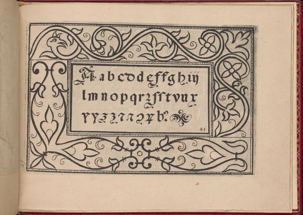
Dimensions: height 167 mm, width 373 mm
Copyright: Rijks Museum: Open Domain
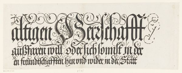
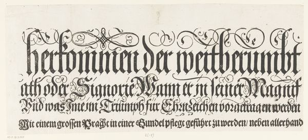
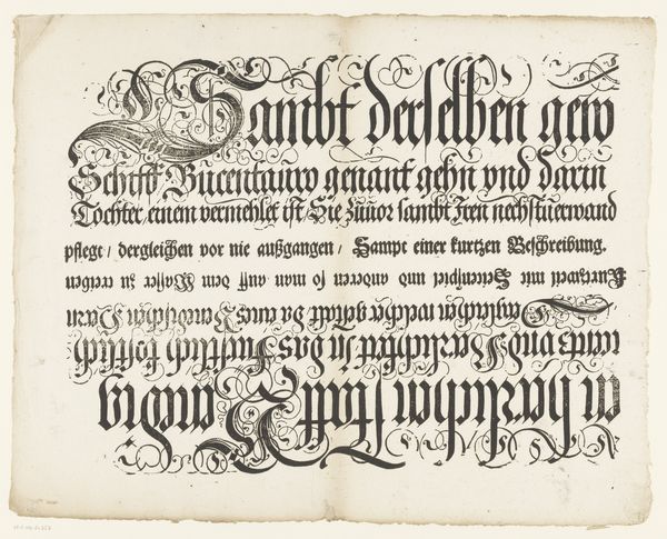
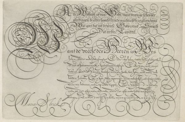
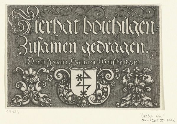
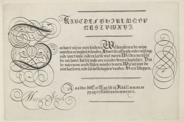
Editor: We’re looking at “Titel van de Festa della Sensa (eerste gedeelte)” created in 1697 by Jost Amman, a print currently housed in the Rijksmuseum. It seems to be a masterful exercise in typography, an engraving. What strikes you when you observe this piece? Curator: The immediate element is line. Observe how the thick, bold strokes of the lettering create a strong visual foundation. This boldness is juxtaposed against the intricate, almost lace-like filigree that weaves around the text. Do you notice how these finer lines create a dynamic interplay with the solid forms? Editor: I see it! The swirling lines almost feel like they're trying to escape the rigidity of the lettering, but also, in places, serve as additional decoration on those thick, black forms, almost like curly serifs on the top line of type. Curator: Precisely! The artist orchestrates a beautiful tension between order and chaos. Also, consider the negative space. It's not merely "empty"; rather it contributes significantly to the overall composition. Notice how the artist uses the negative space between letters and lines to enhance the legibility and create visual interest. How would you say that negative space is helping to define form in this print? Editor: I guess without all the white space, all the letters would meld together. It almost seems to take as much intention and precision to design the space around the words as it does the letters themselves! It feels less like simple decoration and more like a study of shapes and forms. Curator: Precisely. We see in Amman's print, therefore, an exemplar of Baroque aesthetic principles through a calculated study of formal elements like line, form, and space, independent of its literal textual meaning. It transcends mere functionality; it's a dynamic interplay of visual elements, achieving a sophisticated balance. Editor: Thanks so much! Now, seeing that tension between positive and negative space as shapes opens up a way for me to think about design and text as separate yet integrated elements.
Comments
No comments
Be the first to comment and join the conversation on the ultimate creative platform.
More like this