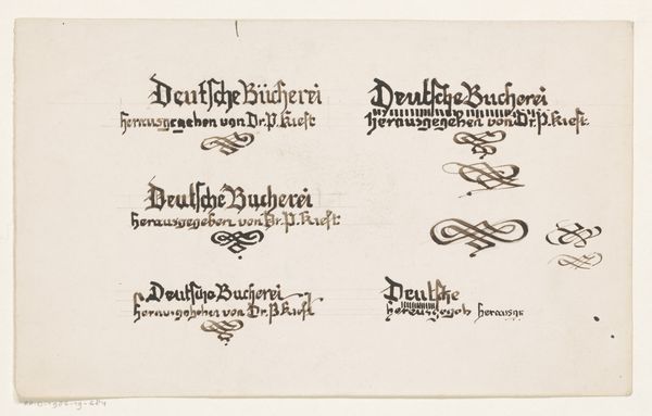
Letterontwerp voor een boek gepubliceerd door dr. P. Kieft 1884 - 1952
0:00
0:00
drawing, graphic-art, typography, ink, pen
#
drawing
#
graphic-art
#
art-nouveau
#
hand-lettering
#
hand drawn type
#
hand lettering
#
personal sketchbook
#
typography
#
ink
#
hand-drawn typeface
#
pen work
#
sketchbook drawing
#
pen
#
handwritten font
#
sketchbook art
#
small lettering
Dimensions: height 130 mm, width 162 mm
Copyright: Rijks Museum: Open Domain
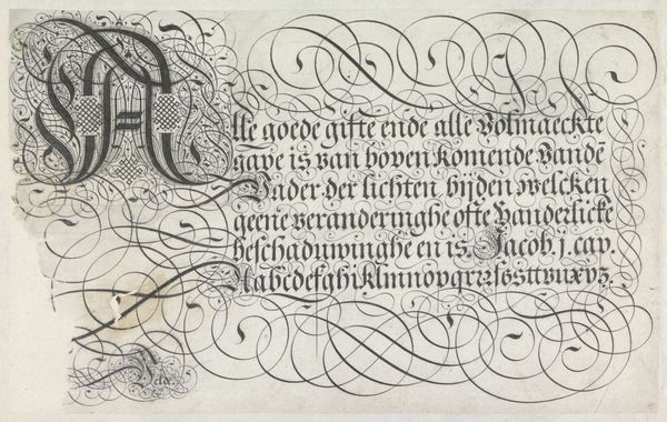
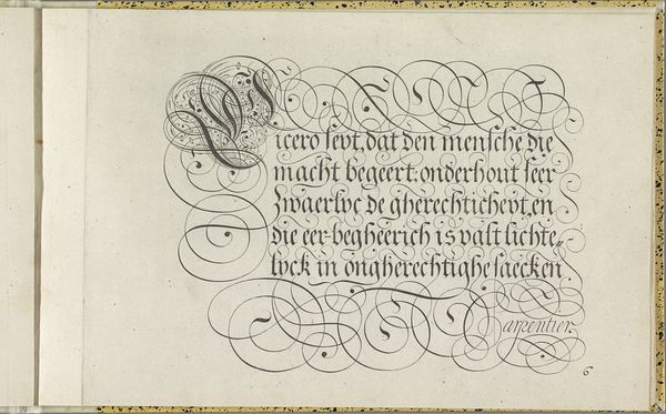
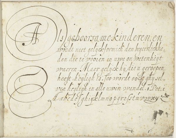
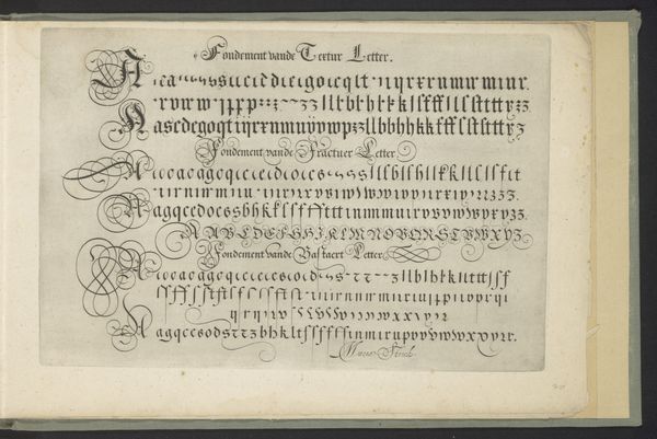
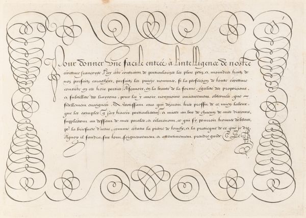
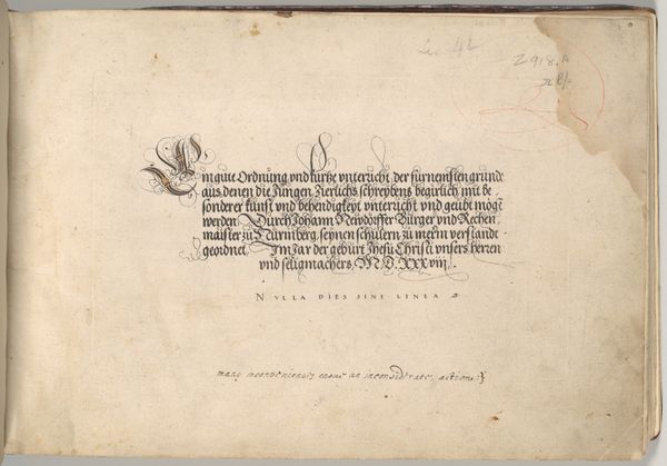
Curator: Welcome. Before us is “Letterontwerp voor een boek gepubliceerd door dr. P. Kieft,” a design for a book published by Dr. P. Kieft, crafted between 1884 and 1952 by Reinier Willem Petrus de Vries. It's an ink drawing, a piece of graphic art showcasing beautiful typography. Editor: It's striking, isn't it? There's a strong, almost gothic sensibility to the lettering, very precise and deliberate. I’m immediately drawn to the way the ink defines the text, making the words into distinct shapes, even sculptures. Curator: Absolutely. De Vries clearly pays homage to the Art Nouveau movement. The hand-drawn nature underscores the skill and labor involved, it speaks to the relationship between artistic production and commercial application. It's a design meant for consumption, for presenting a brand identity. Editor: And how that identity then interfaces with its potential readership is fascinating. Who was Dr. Kieft and his audience? How would the “Deutsche Bucherei,” influence public perception and acceptance? I'm also curious about how such book designs shaped the literary landscape during that time. Were there any trends or standards against which De Vries was working? Curator: Precisely. You also have to appreciate the material presence of ink on paper, the meticulous pen work; De Vries showcases the process and the hand in contrast to industrialized printing methods of the period, elevating the craft involved in typography. Editor: Looking closely, one notices slight variations in the two presented designs; iterations toward a final concept? Or is each a variation intended for different scales or markets, suggesting different production runs based on material availability or printing capabilities? Curator: Those are great considerations, highlighting the material possibilities embedded within. Ultimately, De Vries invites us to consider not only what we read, but how our reading material gains an image, a physical form subject to the influences of its own historical moment. Editor: Yes, an insight to production values. We're invited to delve into publishing's mechanics, the choices shaping our consumption. The act of reading transforms into a material experience molded by the confluence of art, design, and commercial intent.
Comments
No comments
Be the first to comment and join the conversation on the ultimate creative platform.
More like this