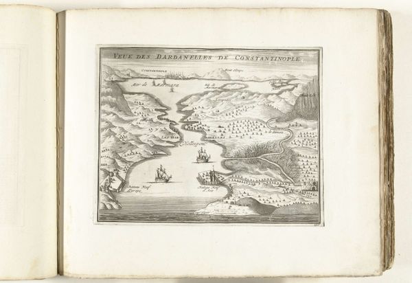
print, etching, engraving
#
baroque
# print
#
etching
#
geometric
#
history-painting
#
engraving
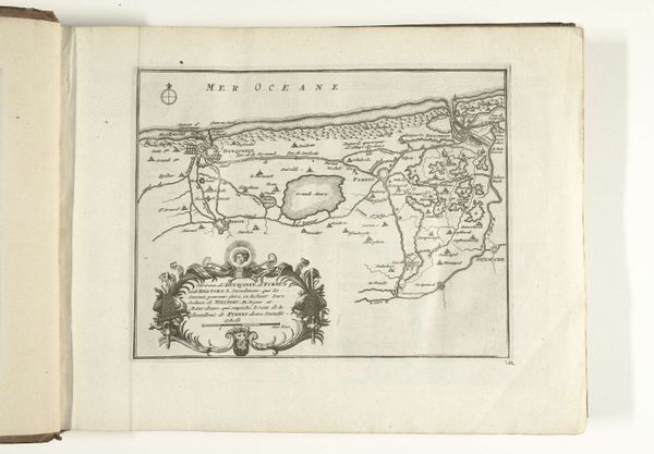
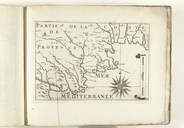
Dimensions: height 231 mm, width 328 mm
Copyright: Rijks Museum: Open Domain
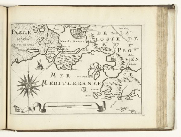
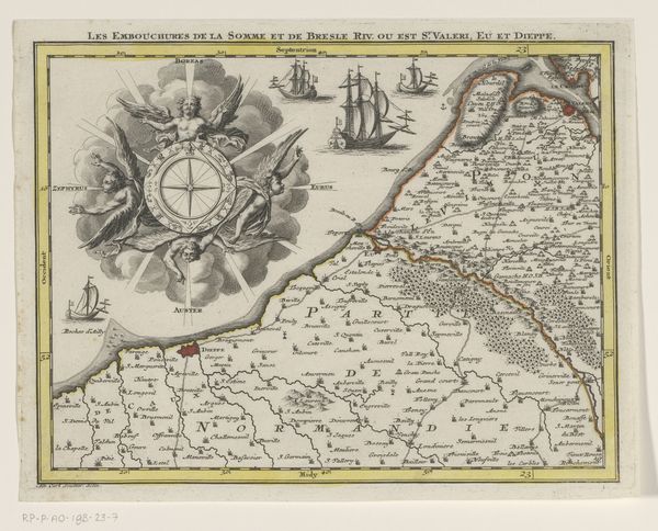
Curator: This intriguing cartographic print, “Kaart van de Franse zuidkust bij Narbonne”, depicts the French Mediterranean coast around 1702. Though the artist remains anonymous, the map resides here at the Rijksmuseum. What is your first impression? Editor: A feeling of expanse—despite the rigid grid, those little ships on the "Mer Mediterranee" look wonderfully free, a little too whimsical to only represent reality. I find it curious how cartography can simultaneously document and evoke a sort of wanderlust, don’t you think? Curator: Indeed, it's an interplay of precision and artistic interpretation characteristic of baroque prints. Note how the etcher contrasts meticulously labeled regions with ornamental flourishes; like the compass rose or even the scripted text that designates territories, it transcends pure functionality. The scale and visual structure work to offer clear guidance alongside cultural markers for this coastal area. Editor: Ah yes, this emphasis on geometry—grids, sharp angles for coastline, and a sun-like compass in the heart of it. But that ornamental flourish also suggests a pride, doesn't it? These territories were obviously very precious to whoever commissioned this map. I’m curious—were maps displayed as declarations? Curator: Absolutely, and for strategic, political ends too. The detailed rendering speaks to France’s ambition and its ability to catalog what it possesses. Look, for instance, at the intricate representation of land and waterways around Narbonne. It served to assert dominance but also provided navigation value—it's fascinating to ponder the relationship of knowledge, power, and aesthetics. Editor: So it's like an aesthetic act of nation-building in a way! I feel myself tracing these rivers with my finger—imagining all the comings and goings, people setting sail toward an endless horizon and new stories. Curator: That poetic allure lies perhaps in the abstraction—in the visual signs that hint at rich geographies. The piece has shown how utility and visual refinement enhance the status, I think. Editor: Yes! And while these images often look like pure observation they do so much cultural work. I'm definitely seeing that push-and-pull of utility and pure aesthetics you’ve discussed.
Comments
No comments
Be the first to comment and join the conversation on the ultimate creative platform.
More like this