#
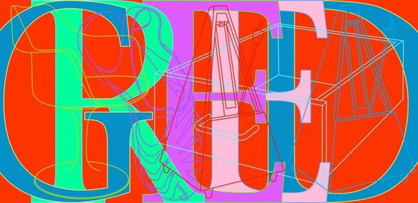
pop art-esque
#
popart
#
random pattern
#
pop art
#
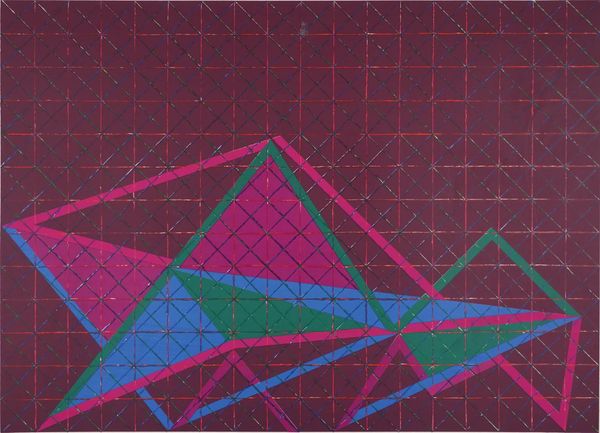
geometric pattern
#
abstract pattern
#
pattern repetition
#
layered pattern
#
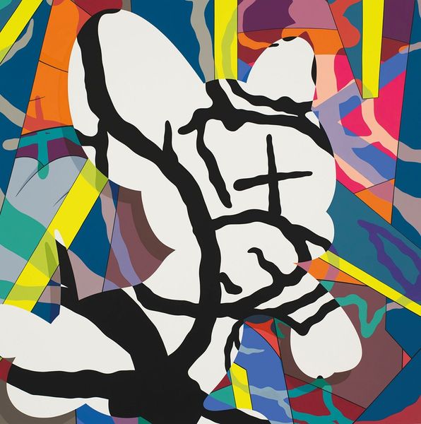
psychedelic
#
funky pattern
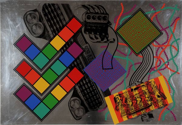
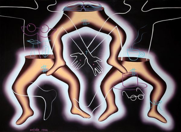
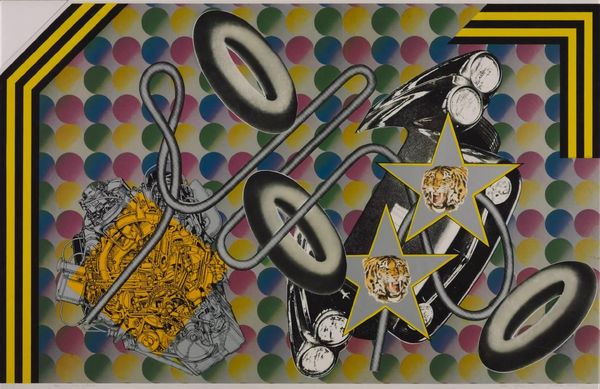
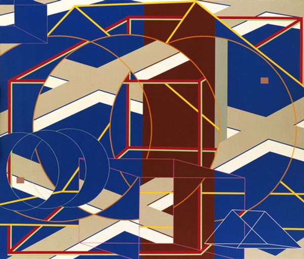
Copyright: Peter Phillips,Fair Use
Editor: This is Peter Phillips' "Custom Print No. II" from 1965. It seems to bring together this engine or some kind of machine with bright, colorful shapes and patterns. It feels quite chaotic but somehow organized, maybe like controlled chaos? How do you interpret this work through a formal lens? Curator: It’s an astute observation. Formally, notice the dynamic interplay of geometric and organic shapes. The hard-edged triangles contrast with the fluid lines suggesting movement, but there is no connection or visual rhythm created. Also, reflect on the image plane, how Phillips layers flat shapes against what appears to be a photographic reproduction, and then an abstracted or stylized rendering. What effect does the layering and spatial ambiguity have? Editor: It creates a sense of depth, but also flattens everything. It’s like a collage, but without the texture, if that makes sense? Curator: Precisely. And note the stark contrasts in color—the intense primaries juxtaposed with muted browns and blacks. Consider how these choices manipulate visual tension and guide the viewer's eye. Do the color choices contribute to the reading, and is there is tension from that contrast? Editor: Yes, definitely. The bright circles draw the eye, competing with the detail of the engine block and those triangular mazes. But if that is the aim, they do not offer visual satisfaction in doing so. Curator: The image challenges traditional notions of depth and perspective. Phillips compels the viewer to engage actively with the artwork, deconstructing its visual language and reassembling meaning, or, as may be, failing to establish meaningful association in its composite arrangement.. Editor: It's fascinating how focusing on the composition and colors reveals the real tension, or absence of, in the artwork. Curator: Indeed, looking closely at these elements really encourages one to deconstruct not just what is included, but what could have been arranged differently for greater impact.
Comments
No comments
Be the first to comment and join the conversation on the ultimate creative platform.
More like this