1904
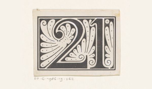
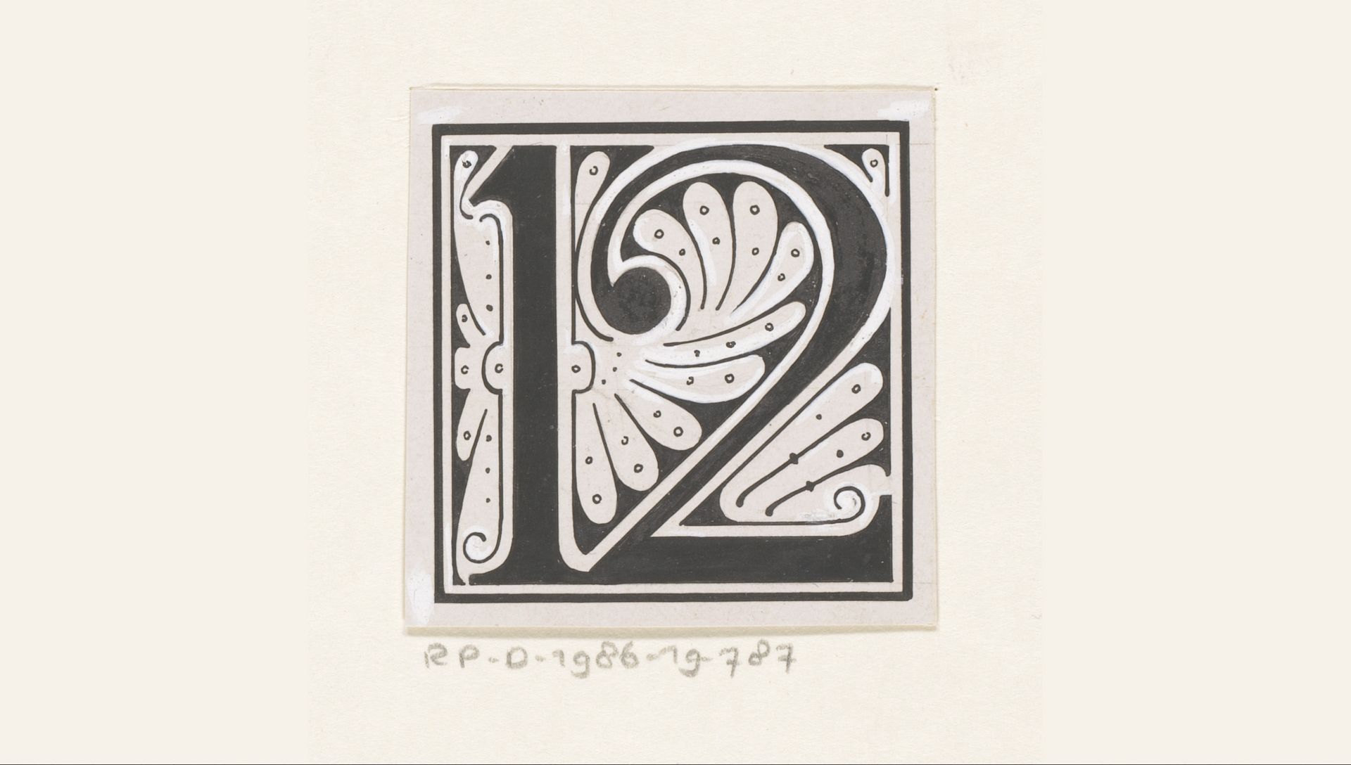
Getal 12
Listen to curator's interpretation
Curatorial notes
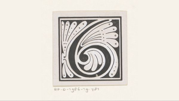
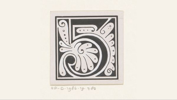
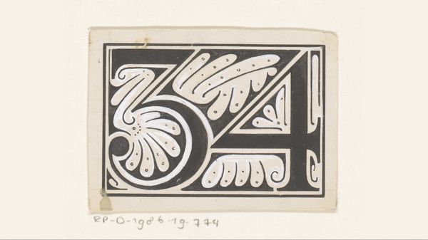
Reinier Willem Petrus de Vries made this tiny little design for the number 12, out of what looks like ink and gouache, sometime in the early 20th century. The beauty of this piece lies in its clean graphic language. It’s all about the bold black shapes playing against the white, creating this crisp, almost stenciled feel. Look at the way the black hugs the white, like it's trying to contain it, but the white insists on peeking through, softening the edges. There's a real tension here, a kind of push and pull that gives the piece its energy. Notice the little dots carefully placed in each white section of the two. It’s almost as if the artist is emphasizing the contrast. De Vries’ design reminds me a bit of Hilma af Klint’s early explorations of geometric forms, though he’s working with more recognizable imagery here. Ultimately, this piece shows how even a simple design can become a playground for the artist, full of possibilities and quiet revelations.
