1904
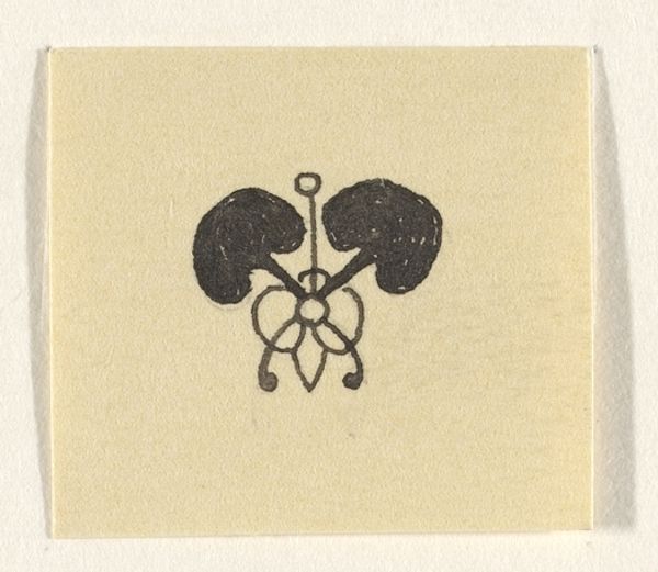
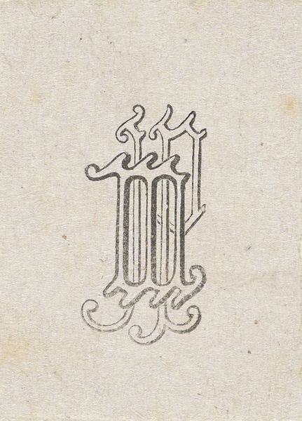
Initiaal R
Listen to curator's interpretation
Curatorial notes
Reinier Willem Petrus de Vries made this small Initial R, and right away, I’m drawn to its intricate play with form. There is a tension between the stark graphic quality of the letter itself and the almost floral embellishments that soften its edges. Those little leaf shapes bursting out from the 'R' seem to want to escape the rigidity of the letter. Looking closely, you can see how the black ink isn’t uniform; there are slight variations in tone, suggesting a hand-rendered quality, despite its print-like appearance. The choice of black and white amplifies the contrast, but it also invites you to fill in the gaps, to imagine it in color, or to see the negative space as actively shaping the letter. It reminds me a bit of some early illuminated manuscripts, where letters weren't just carriers of text but artworks in their own right, blurring the line between functionality and pure aesthetic pleasure. In the end, art often lives in these sorts of ambiguities.