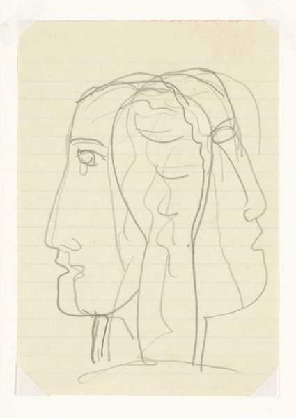
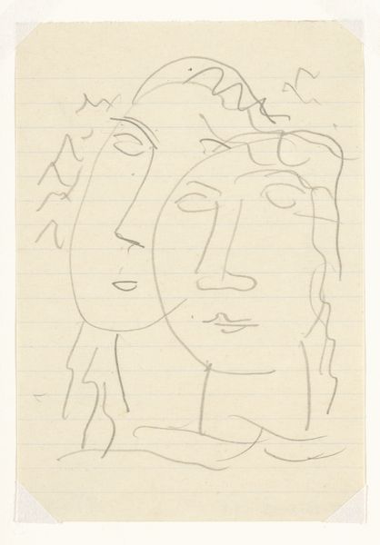
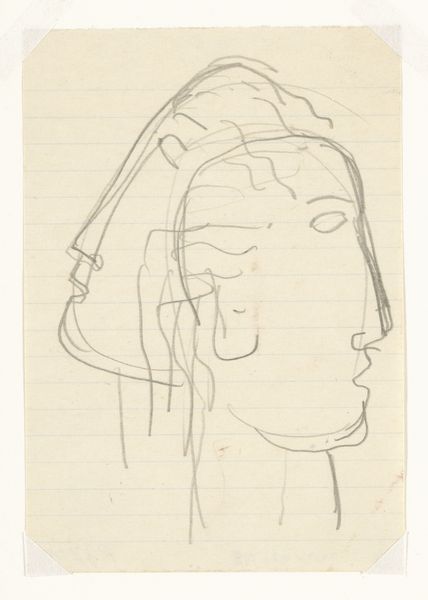
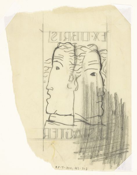
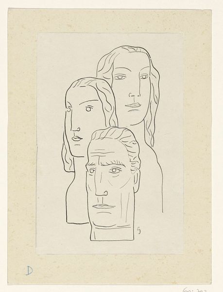
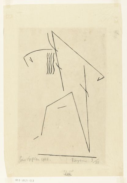
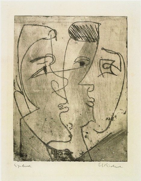
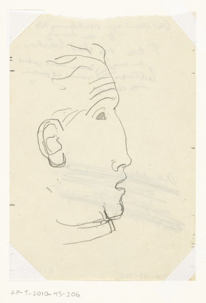
Omslagontwerp voor: Paul Fierens, L'art hollandais contemporain, 1933 c. 1931 - 1933
0:00
0:00
leogestel
Rijksmuseum
drawing, pencil
#
portrait
#
drawing
#
imaginative character sketch
#
light pencil work
#
childish illustration
#
caricature
#
cartoon sketch
#
personal sketchbook
#
character sketch
#
ink drawing experimentation
#
pencil
#
line
#
sketchbook drawing
#
cartoon style
#
modernism
Dimensions: height 122 mm, width 85 mm
Copyright: Rijks Museum: Open Domain
Editor: This is Leo Gestel's cover design for Paul Fierens' "L'art hollandais contemporain," dating from around 1931-1933. It's a simple pencil drawing featuring overlapping faces, and it feels incredibly modern, almost like a cubist exploration of portraiture distilled down to its most basic lines. What formal qualities strike you when you look at this work? Curator: Indeed, the linear quality is paramount. Notice how the composition relies entirely on line to delineate form and space. The superimposition of faces is not merely representational, but a structural device. Do you observe how the varying line weights create a sense of depth, even though the palette is monochromatic? Editor: I do. The heavier lines definitely bring forward certain facial features. It’s interesting how he creates shading and volume using only line density. Does the simplicity detract from the complexity of the portrait? Curator: On the contrary. The reduction to essential lines foregrounds the underlying structure. The economy of means draws our attention to the artist's hand and the intentionality behind each stroke. Consider how the parallel lines of the notebook paper beneath further emphasize the graphic nature of the piece, almost flattening the image despite the implied depth. Editor: That makes me appreciate the image even more! It's like Gestel is playing with the inherent flatness of the drawing surface. It is not just a picture, but an image aware of itself. Curator: Precisely. Furthermore, the subtle shifts in perspective within each face disrupt any easy reading, forcing the viewer to actively reconstruct the forms. The overlapping structure gives dimension, but because we see the flatness, that is where we get some perspective, literally! Editor: It is incredible how much visual information and artistic intent can be communicated through something so simple. I am learning a lot about portraits. Curator: Indeed, the beauty lies in the meticulous construction of form through line.
Comments
No comments
Be the first to comment and join the conversation on the ultimate creative platform.
More like this