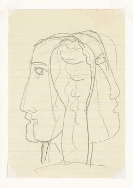
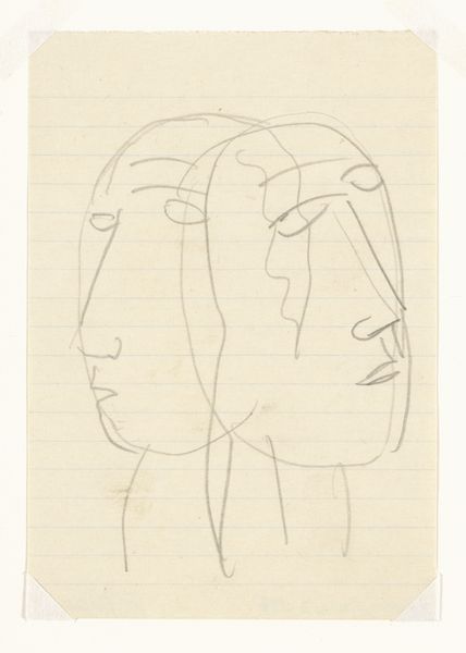
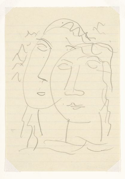
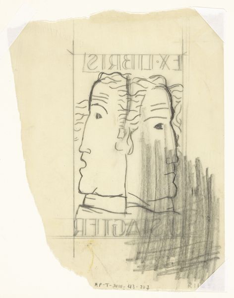
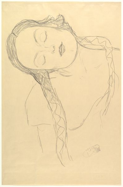
Omslagontwerp voor: Paul Fierens, L'art hollandais contemporain, 1933 c. 1931 - 1933
0:00
0:00
leogestel
Rijksmuseum
drawing, pencil
#
portrait
#
drawing
#
form
#
pencil
#
line
#
profile
Dimensions: height 122 mm, width 85 mm
Copyright: Rijks Museum: Open Domain
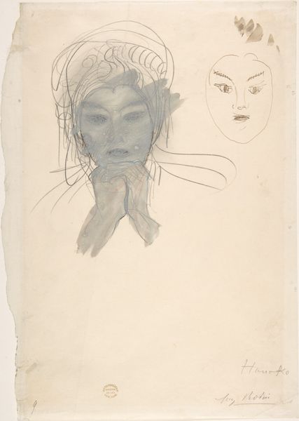
Editor: This drawing, an apparent cover design by Leo Gestel for Paul Fierens’ book, “L’art hollandais contemporain”, or “Contemporary Dutch Art”, dates to about 1931-1933. It is done in pencil, on what looks like lined paper. It strikes me as remarkably raw and unfinished. What do you see in this piece? Curator: The drawing displays a fascinating tension between figuration and abstraction. Note the almost mathematical precision of the profile’s outline juxtaposed with the fluid, almost chaotic, rendering of the hair or headdress. Gestel emphasizes line as a primary means of delineating form, yet the lines themselves seem hesitant, searching. Editor: Searching? In what way? Curator: Observe the multiple lines used to define the contour of the face and head. This suggests an iterative process, a quest for the ideal form rather than a definitive statement. Is it the imprecision of line? The composition appears carefully considered. The head is positioned dynamically within the frame, neither perfectly centered nor aligned, creating a subtle visual tension. This disrupts any sense of static representation. Editor: So you're saying the imperfection *is* the statement? Curator: Precisely! It highlights the materiality of the drawing process itself – the artist's hand at work. In his method, the emphasis is not just on *what* is depicted, but *how* it is depicted. Gestel seems more invested in the exploration of form and line than in achieving a perfect likeness. This is, perhaps, a comment on modern portraiture itself, leaning away from pure representation. Editor: I see it now; focusing on *how* aligns with modernism’s departure from traditional artistic goals. Curator: Exactly. That emphasis and interplay adds another rich layer to the work. Thank you for pointing that out! Editor: Thank *you* for clarifying this for me!
Comments
No comments
Be the first to comment and join the conversation on the ultimate creative platform.
More like this