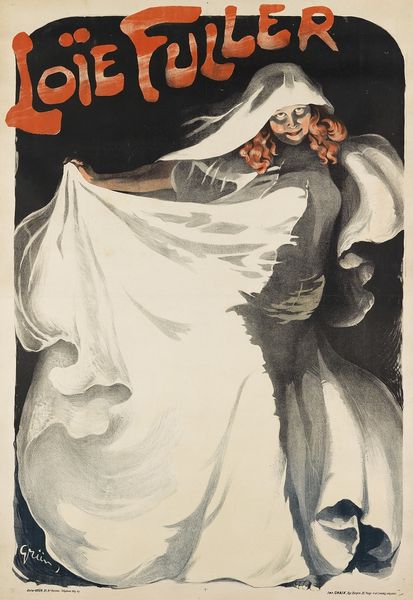
graphic-art, print, poster
#
graphic-art
# print
#
pop art
#
figuration
#
orientalism
#
japonisme
#
poster
Dimensions: Sheet: 23 × 17 in. (58.4 × 43.2 cm)
Copyright: Public Domain
This is 'Sunset Magazine: April', a poster by William Stevens, likely a print. The palette is really interesting; these flat, muted colors, salmon pinks and olive greens, contrasted against the golden yellow background feel modern. Stevens embraces the flatness of printmaking, foregoing the usual tricks of shading or depth. Check out the figure’s robes. Notice how Stevens outlines everything in this clean, decisive way, allowing the different sections of color to sit alongside each other. It's a bold move, and it really works. I love how the formal elements work together, the curve of the character’s sleeve echoes the arc of the setting sun, all these formal echoes lend the work a sense of visual unity. Stevens is playing with our expectations of depth and perspective. Reminds me of some of David Hockney's poster designs, where he flattens out space to create these iconic images. It’s a way of seeing the world that embraces ambiguity.
Comments
No comments
Be the first to comment and join the conversation on the ultimate creative platform.
More like this