drawing
portrait
art-deco
drawing
imaginative character sketch
quirky sketch
sketch book
cartoon sketch
personal sketchbook
sketchbook drawing
watercolour illustration
genre-painting
storyboard and sketchbook work
cartoon carciture
sketchbook art
Copyright: Public domain US
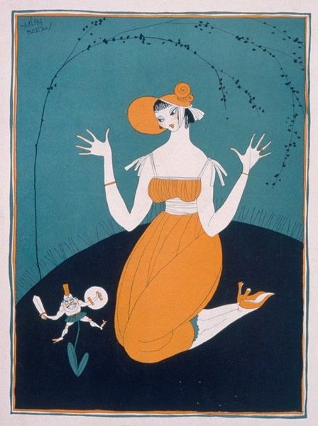
Emmerico Nunes made this cover for "ABC - Revista Portugueza" in 1923, and you can see the printmaking process at work in its flat planes of color and bold linework. It’s like Nunes is saying, "Here's summer, folks! Graphic, punchy, and ready for the beach." I like the way the orange tone works with the negative space of the page. See how the orange links the various elements, from the stripes of the beach tent, to the seated woman’s dress, and the beach umbrella at the bottom. The black outlines around the figures give the image a playful, cartoon-like quality. This makes me think of art deco posters, with their simple shapes and bold colors. The way he simplifies forms reminds me of early modernist painters, like Matisse or Derain, who were also interested in flattening space and using color expressively. It’s like Nunes is taking high art ideas and making them accessible for a magazine cover. He reminds us that art is always a conversation, pulling from the past while looking toward the future.
Comments
No comments
Be the first to comment and join the conversation on the ultimate creative platform.