drawing, paper, ink, engraving
#
portrait
#
pencil drawn
#
drawing
#
neoclacissism
#
pencil sketch
#
paper
#
archive photography
#
ink
#
pencil work
#
engraving
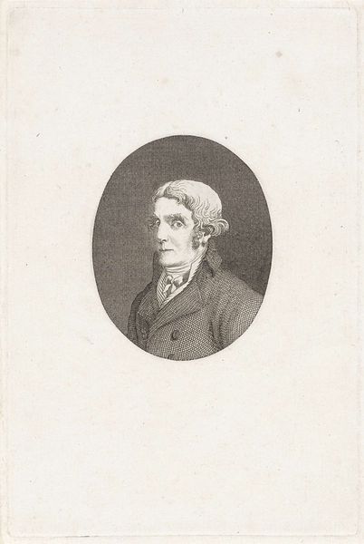
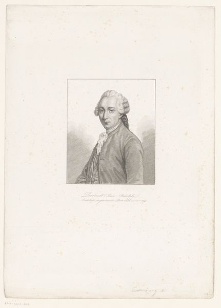
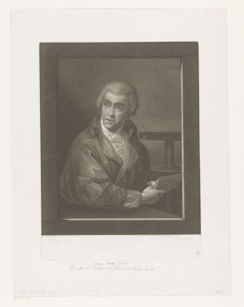
Dimensions: height 174 mm, width 113 mm
Copyright: Rijks Museum: Open Domain
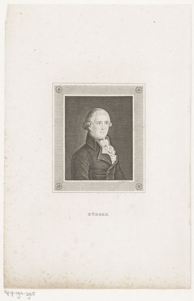
Editor: Here we have Theodorus de Roode's "Portret van Thomas Paine" from 1792, a drawing on paper, using ink and engraving. It’s… quite pensive, isn't it? Almost melancholic. How do you interpret this work from a formal perspective? Curator: The portrait demonstrates a studied balance in its composition. Notice the pyramidal structure created by Paine's posture and the strategic placement of light. What effect does this distribution have on the viewer? Editor: It definitely draws your eye to his face, that bright highlight on his forehead… it makes him seem very thoughtful. But what about the lines? Are they significant? Curator: Precisely. The precision of the engraved lines speaks to Neoclassical ideals: clarity, order, and a certain emotional restraint. How does the hatching contribute to the overall impression of the figure? Editor: I see it! The cross-hatching adds depth and volume. It’s almost mathematical in its precision, lending the image a sense of… controlled intensity, I guess. Curator: Controlled is a fitting descriptor. Consider the contrast between the smoothness of the face and the texture of the coat. This creates a visual dynamism within the work. It emphasizes texture through juxtaposition, a critical technique in portraiture. Editor: I never noticed that before! I was so focused on the subject's expression. Thanks. It really does change my perception. Curator: Formal analysis encourages this slow looking. Reflecting on how simple elements, when combined thoughtfully, can communicate a wealth of ideas, no?
Comments
No comments
Be the first to comment and join the conversation on the ultimate creative platform.
More like this