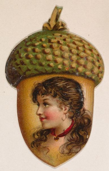
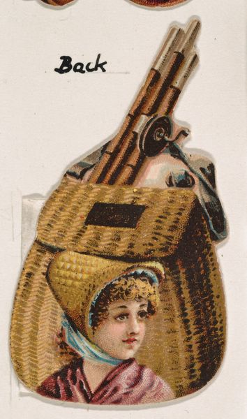
Ear of Corn, from the Novelties series (N228, Type 3) issued by Kinney Bros. 1889
0:00
0:00
Dimensions: Sheet (Round): 1 9/16 × 1 9/16 in. (4 × 4 cm)
Copyright: Public Domain
Curator: This is "Ear of Corn, from the Novelties series," created by the Kinney Brothers Tobacco Company in 1889. The medium seems to be drawing or print, and it’s currently held at the Metropolitan Museum of Art. What's your initial reaction? Editor: Well, my first impression is just sheer whimsy! It's an odd, slightly surreal portrait contained within the shape of an ear of corn. The limited color palette, mainly reds and greens, gives it a vibrant yet controlled aesthetic. Curator: The composition definitely strikes one as unique. I find the interplay between the hard, geometric shapes of the corn kernels and the soft, flowing lines of the woman's clothing especially compelling. The texture and gradient applied to the corn create an almost sculptural presence within the flat, printed format. Editor: Agreed. I find myself wondering about the cultural context of its creation, as the Kinney Brothers were, first and foremost, a business. Was this type of image common in tobacco advertisements of the period? What associations did the designers intend to create with this strange figuration, combining, as it does, portraiture and agricultural motifs? Curator: Undoubtedly, this would have had great value as an advertisement. The Ukiyo-e influences, apparent in the stylized presentation, would certainly appeal to their audience. I am drawn to the portrait and her very elaborate attire with the plumed hat. Note how that element reinforces a sense of upward visual thrust within the design. Editor: Interesting how it embodies both commercial appeal and also touches upon prevailing cultural trends. Its blend of natural forms and high-society portraiture is unusual for product promotion of the time. You wouldn’t expect that conceptual combination, yet here we are! What this tells me is that cultural identity and social positioning could be achieved even with small items of the consumer culture of that day. Curator: That’s a fascinating interpretation of the era. A visual culture of commercial identity through unexpected visual associations. In terms of its form, the subtle contrast between the matte illustration of the portrait and what looks like the reflective sheen printed onto the kernels produces a multi-layered, dynamic surface, further adding to this curious, very charming piece. Editor: So in short, both as a visual object and as a symbol of the culture of its time, it appears more conceptually rich and playful than its intended role suggests. A very unusual item of corporate communication.
Comments
No comments
Be the first to comment and join the conversation on the ultimate creative platform.
More like this