graphic-art, print, engraving
#
graphic-art
#
dutch-golden-age
# print
#
14_17th-century
#
watercolour illustration
#
history-painting
#
engraving
#
watercolor
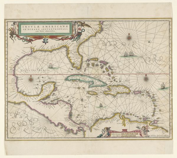
Dimensions: height 502 mm, width 580 mm
Copyright: Rijks Museum: Open Domain
Editor: Here we have Cornelis Danckerts' "Kaart van het Caraïbisch gebied," a map of the Caribbean, created between 1680 and 1696, employing engraving and printmaking. It gives the Caribbean a surprisingly pastel-toned palette. What story does this map whisper to you? Curator: Ah, maps! They’re never just about geography, are they? This one, with its delicate watercolouring, is really a story of ambition, conflict, and colonial desire dressed up as science. See how strategically certain islands are coloured? Almost like claiming territory with pigment. What isn't on the map, or how things are represented, tells a larger, potent, truth, no? Editor: It's like a beautiful facade hiding… something else. Curator: Precisely! It’s a 'pretty lie.' What looks decorative – those little cherubs blowing winds– they're actually symbolizing European power pushing its way across the ocean. Consider the perspective, too: who decided what was important enough to be named, detailed, emphasised? Every map is a choice. And whose choices do they reflect? Editor: So, reading this map isn’t just about locations, it’s about understanding the intentions of the cartographer, and the historical context behind those intentions? Curator: Exactly! It makes you wonder, doesn't it, about all the other ‘maps’ we encounter in life, the versions of reality we are handed… and what perspectives *they* represent? Perhaps this map invites a critical look, encouraging us to navigate through layered meanings. Editor: That makes me want to go and compare it with contemporary maps and dig for missing stories. Thanks. Curator: My pleasure, it only takes a good map to start questioning the terrain!
Comments
No comments
Be the first to comment and join the conversation on the ultimate creative platform.
More like this