drawing, graphic-art, print
#
drawing
#
graphic-art
#
organic
#
art-nouveau
# print
#
form
#
organic pattern
#
line
#
decorative-art
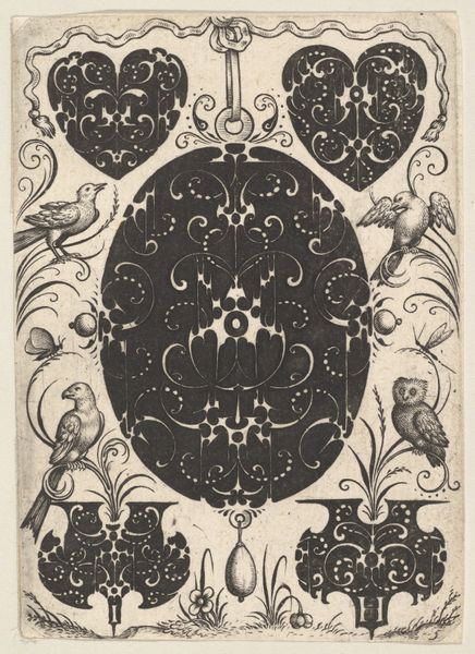
Dimensions: height 81 mm, width 65 mm
Copyright: Rijks Museum: Open Domain
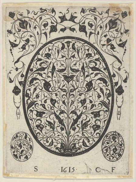
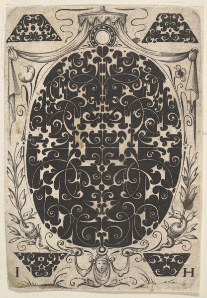
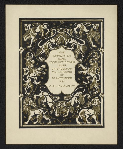
Curator: Here we have an intriguing "Ex libris voor Klaas Groesbeek en Paul Nijhoff," by Gerrit Willem Dijsselhof, created sometime between 1876 and 1924. It is currently held here at the Rijksmuseum. What's your initial read on this piece? Editor: My first impression is that of a self-contained, almost meditative composition, utilizing a fairly limited palette. The stark contrast certainly grabs attention, emphasizing form over tonal variation. I am especially drawn to the stylized rendition of organic life within these constructed borders. Curator: The intertwining of nature and design feels distinctly Art Nouveau, wouldn't you say? Roses, thorns, leaves... all carefully positioned around the bold letters, almost as if nature itself is framing and guarding knowledge. It serves to invoke memory as an eternal embrace by time. Editor: Absolutely. The deliberate use of line and decorative patterning underscores Art Nouveau's dedication to elevating craft, especially prints and drawing like this piece, "Ex Libris," is primarily concerned with symbolic communication; I wonder how the composition uses semiotics. Curator: This was designed as a bookplate. See the entwined initials 'K.G.' and 'P.N.' integrated seamlessly within the organic composition. The use of thorny roses could symbolize a protective embrace, conveying perhaps that wisdom can only be acquired when you dare to cut and to bleed to know what reality is truly about. The fish motif below, feels symbolic too of course: perhaps of abundance, of being connected to the earth. Editor: It's striking how the artist achieved visual equilibrium. Note the weight of the stylized flora carefully balancing the geometry of the borders and typography. Dijsselhof is controlling how organic shapes are balanced, a key component of pictorial unity. And then he's cleverly positioning 'K.G.' and 'P.N.' as to give the composition clear stability and make the message evident. Curator: Indeed. A personalized bookplate functioned, and continues to function, as a statement about the owner. It reflects intellectual leanings or personal values. Here it whispers about intellectual curiosity, and maybe the intertwined fish at the bottom suggest friendship too? A bond forged perhaps by the pursuit of knowledge. Editor: I find that especially telling of this bookplate design—the deliberate fusion of personal symbolism with larger stylistic trends encapsulates this historical moment beautifully. Curator: Indeed. Viewing the image through the lens of symbolic and cultural encoding adds depth to an already beautifully executed piece of graphic art. Editor: Examining the compositional elements reveals how Gerrit Willem Dijsselhof masterfully balances line, shape, and contrast to achieve something elegant.
Comments
No comments
Be the first to comment and join the conversation on the ultimate creative platform.
More like this