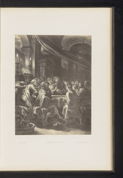
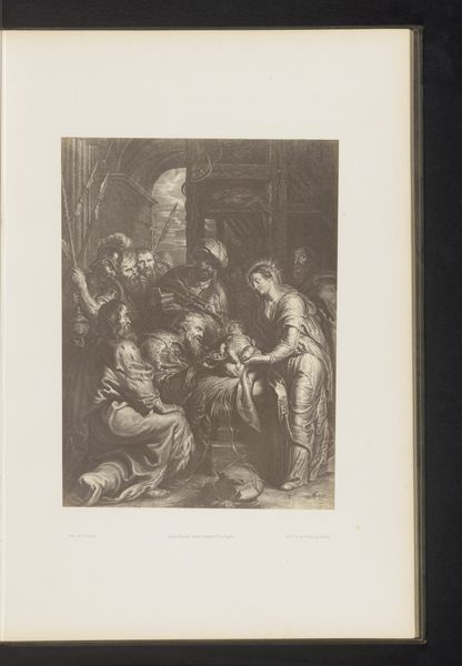
Fotoreproductie van een gravure van De uitstorting van de heilige geest door Paulus Pontius, naar het schilderij door Peter Paul Rubens before 1858
0:00
0:00
Dimensions: height 311 mm, width 225 mm
Copyright: Rijks Museum: Open Domain
Editor: Here we have a reproduction of "The Descent of the Holy Spirit" by Peter Paul Rubens, engraved by Paulus Pontius. This particular print dates to before 1858 and presents such a dramatic, almost chaotic scene. What are your initial thoughts when considering its composition and form? Curator: Immediately striking is the use of light and shadow, or chiaroscuro. Notice how the light, presumably emanating from the Holy Spirit depicted as a dove at the top, illuminates certain figures while others recede into darkness. This directs our gaze, creating a visual hierarchy. Editor: That’s true, I see that now. Is that a typical device within the Baroque style? Curator: Indeed. It heightens the drama and engages the viewer on an emotional level, a hallmark of Baroque art. But observe further – how does Pontius, the engraver, use line and texture to differentiate the figures and the architecture? Editor: There’s a clear contrast in textures. The drapery has very fluid lines compared to the rigid, strong lines used for the building’s columns. The figures closest to us have very refined lines as well. Is there some sort of visual language in use to denote which elements are the most critical? Curator: Precisely. The strategic use of line weight, density, and directionality isn't merely decorative; it creates depth, defines form, and guides the viewer's eye through the complex space. In the figures’ faces, which appear full of awe, notice how small lines help express the dynamism of the scene. Do you see a structural arrangement that helps the viewer? Editor: It's almost like a pyramid. The figures form a wide base, narrowing towards the top where the dove resides, with the light converging down towards Mary. Curator: Precisely. The convergence contributes to the image's meaning and enhances the composition as a cohesive visual unit. Editor: That makes the complex subject much easier to visually interpret! I'll definitely look at prints in a new light going forward.
Comments
No comments
Be the first to comment and join the conversation on the ultimate creative platform.
More like this