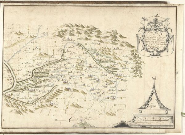
drawing, paper, watercolor, ink
drawing
baroque
landscape
paper
watercolor
ink
history-painting
Dimensions: height 404 mm, width 478 mm
Copyright: Rijks Museum: Open Domain
Editor: This is "Kaart van het Paradijs," or "Map of Paradise," by Dirk Janszoon van Santen, created around 1700, using ink, watercolor, and drawing on paper. It's quite a fascinating landscape, though the cartography seems rather… imaginative. What strikes you most about its composition? Curator: The initial visual impact arises from the juxtaposition of meticulous detail and fanciful geography. The precise rendering of mountains, rivers, and settlements contrasts sharply with the symbolic content. Do you observe how the artist employs a limited palette? Editor: Yes, there’s a very consistent use of earthy tones and blues, almost like a classical painting. Is that color selection significant? Curator: Absolutely. The restrained use of color emphasizes the structured contours of the landscape, inviting the eye to follow deliberate lines and patterns. Note, also, the subtle gradations that lend a three-dimensional quality, a careful manipulation of light and shadow that invites closer scrutiny. What do you notice about the relationship between the land and the sea? Editor: Well, the land dominates the composition. The sea appears almost as an afterthought. It doesn't quite connect spatially. Curator: Precisely. This dislocation between land and sea destabilizes our conventional understanding of geographical representation, prompting us to focus on its intrinsic formal properties—line, color, and space—rather than any pretense of mimetic accuracy. What implications might this have on its interpretation? Editor: I see your point. The formal choices pull the viewer away from the map’s ostensible purpose and direct our attention toward… something more abstract, like an allegory. Curator: Indeed. This artwork embodies the fusion of objective cartography with subjective expression. It’s a dynamic interplay between meticulous execution and imaginative interpretation, prompting us to question the very nature of representation itself. Editor: That makes sense. I hadn't considered how the stylistic and compositional elements could supersede the geographical information. I learned a lot about looking for what is right in front of you rather than thinking what could be there instead.
Comments
No comments
Be the first to comment and join the conversation on the ultimate creative platform.