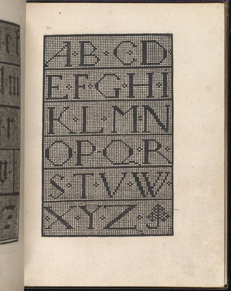
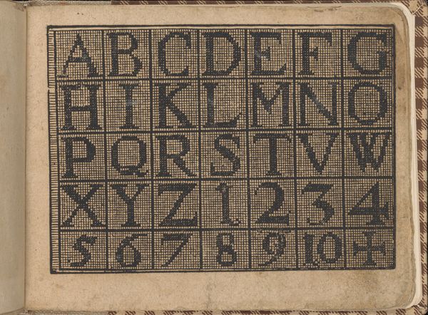
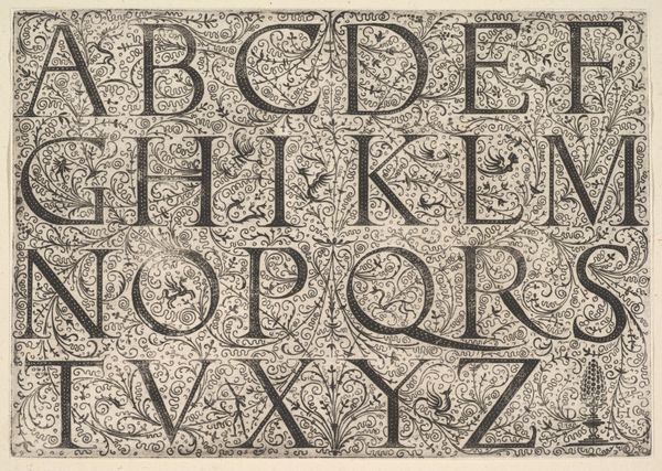
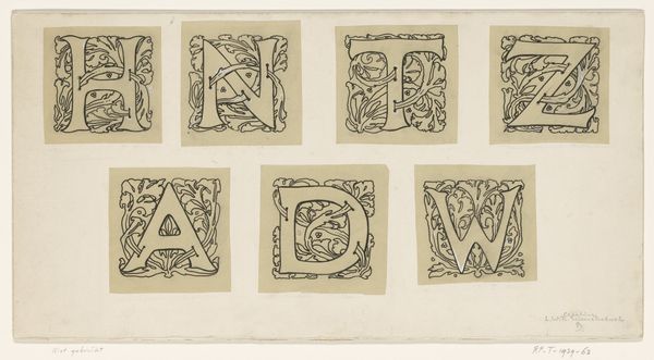
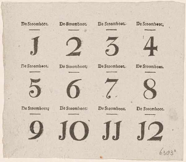
graphic-art, typography
#
font and typography
#
graphic-art
#
photo
#
typeface
#
typographical layout
#
sans serif
#
typography
#
text-heavy
#
geometric
#
thick font
#
sans-serif
#
handwritten font
#
sans serif type
Copyright: Public domain
Editor: Here we have Eric Gill’s "Sample Image for the Font Joanna Nova." It's a graphic art piece demonstrating a typeface. It’s interesting how the different weights and forms create distinct moods; some sections feel quite formal, others almost playful. How do you interpret this work purely from a formalist perspective? Curator: Well, considering its intrinsic qualities, observe how Gill meticulously balances positive and negative space. The interplay between the thick and thin strokes in the letterforms generates a rhythm. Note the contrast between the heavier 'Joanna' and the lighter 'Ditchling' – how does that affect your perception? Editor: It seems almost like a visual hierarchy, with ‘Joanna’ demanding more attention. The shapes feel very geometric to me, almost architectural. Curator: Precisely! Gill’s background certainly influenced his type design. Semiotically, each letter functions as a sign, but together they form words and convey meaning. What feelings do these specific letterforms evoke? Do they appear modern, traditional, or something else entirely? Editor: I find them to be modern, but with a classical touch. It's interesting to think about the design of each letter and its visual impact when it is part of something larger, like a word. Curator: Indeed, examining the micro-elements—the serifs, the curves—allows us to decode Gill's design philosophy and how structural elements create cohesion. Typography, at its core, is a system. By understanding the relationships within this system, we can truly appreciate the artistry and precision of this work. Editor: That makes me think about how fonts can shape our reading experience and influence how we understand written information! Thank you. Curator: A pertinent observation. It reveals how seemingly simple formal choices can have profound effects.
Comments
No comments
Be the first to comment and join the conversation on the ultimate creative platform.
More like this