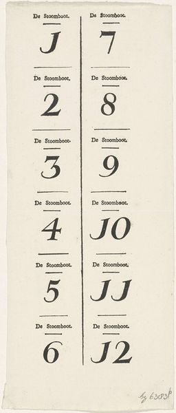
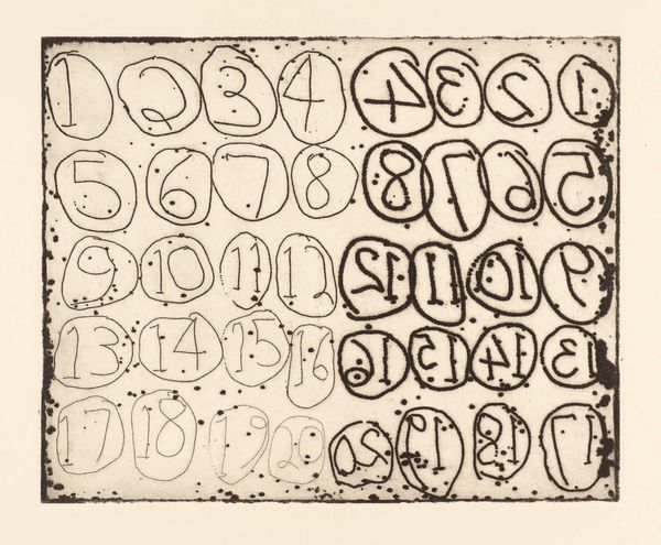
Cijferkaart bij het Stoombootspel, ca. 1823-1829 1823 - 1829
0:00
0:00
theodorusjohanneswijnhovenhendriksen
Rijksmuseum
graphic-art, print, etching, typography
#
portrait
#
graphic-art
#
type repetition
#
sand serif
#
aged paper
# print
#
typeface
#
etching
#
hand drawn type
#
figuration
#
typography
#
fading type
#
geometric
#
stylized text
#
thick font
#
handwritten font
#
classical type
Dimensions: height 143 mm, width 167 mm
Copyright: Rijks Museum: Open Domain
Curator: Welcome. Let’s consider this intriguing piece: a numerical card, an etching dating from 1823-1829 by Theodorus Johannes Wijnhoven-Hendriksen, now held at the Rijksmuseum. It seems part of a game. Editor: My first impression is the visual rhythm created by the grid. The type feels deliberately weighted, each number anchored by that phrase "De Stoomboot"–a captivatingly methodical arrangement. Curator: Exactly! "De Stoomboot" references "The Steamboat Game". These numbered cards were used as instructional guides or markers. It shows the popular fascination with technological advancements; steamboats, symbols of progress, directly influencing popular culture. Editor: Note how the artist employed a restrained palette, limited to the tonal contrast of the ink on the aged paper. This reduction to essential elements—number, text, line—underscores a calculated design. Curator: The ubiquity of these images played a role in shaping perceptions of technology. Print became the major visual medium. It democratized these advances and turned these inventions into symbols. This print is more than just design, it becomes propaganda. Editor: You’ve noted the design. Look closely at the imperfections of the line, the inconsistent ink distribution that speak to its handcrafted nature. Each card, I would argue, holds unique subtleties and tactile qualities which would be lost in more modern approaches. Curator: Considering the context of burgeoning industrialization, that subtle hand touch serves a key role. The imperfection is key. It represents an era on the cusp of machine-made perfection, where handmade retains value, even alongside symbols of progress. Editor: Absolutely, those small deviations from uniformity elevate this seemingly functional object. It makes the piece deeply visually resonant to the era that made it, and beautiful today. Curator: A beautiful piece that underscores how cultural trends find expressions in the humblest forms. It reminds us the cultural impacts even on simple aspects of life like family games. Editor: A testament, perhaps, to how effective the simple integration of material, craft and presentation of these formative printing techniques can impact society’s changing views of a burgeoning industrial era.
Comments
No comments
Be the first to comment and join the conversation on the ultimate creative platform.
More like this