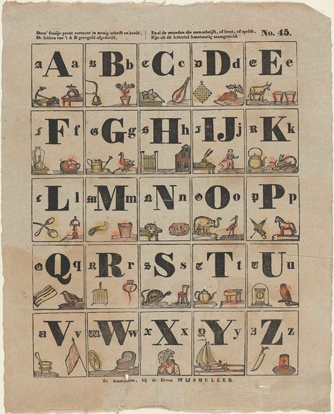
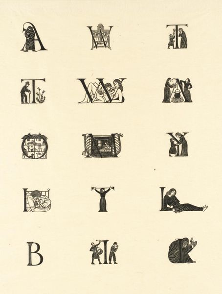
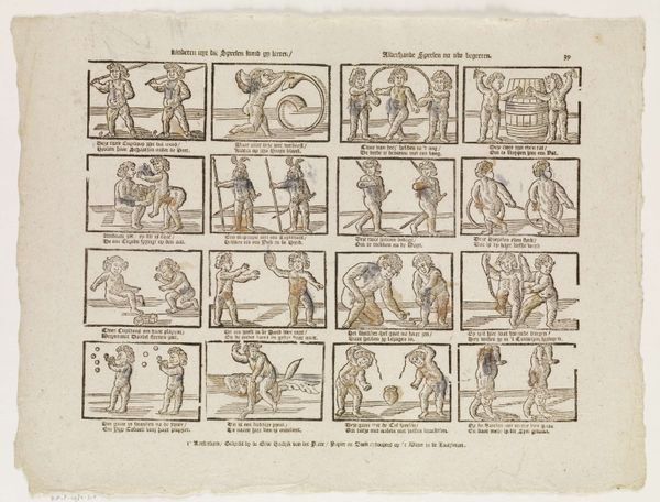
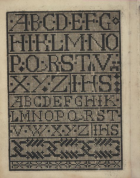
Deez' fraaije prent vertoont in menig schrift en beeld, / De letters van 't A B geregeld afgedeeld, / En al de woorden die men schrijft, of leest, of speldt, / Zijn uit dit lettertal kunstmatig zaamgesteld 1834 - 1850
0:00
0:00
theodorusjohanneswijnhovenhendriksen
Rijksmuseum
graphic-art, print, paper, typography, engraving
#
graphic-art
# print
#
old engraving style
#
paper
#
typography
#
pen work
#
genre-painting
#
engraving
Dimensions: height 413 mm, width 337 mm
Copyright: Rijks Museum: Open Domain
Curator: Walking through the Rijksmuseum today, we find ourselves face to face with "Deez' fraaije prent vertoont in menig schrift en beeld," a work on paper created between 1834 and 1850 by Theodorus Johannes Wijnhoven-Hendriksen. Editor: Well, hello there, curious grid! My first thought? It feels so... organized, yet strangely comforting. It's like a sampler for the soul. Curator: It’s an engraving that masterfully uses typography to create an educational alphabet sheet, a delightful piece of genre painting made for the eyes of children. Note the images corresponding to each letter – a bell for "B," a watering can for "G," all rendered with delicate precision. Editor: Absolutely, but it's more than just an alphabet! I mean, each letter is so ornate. They all carry little narratives. And that subtle use of color—a whisper of blue and a hint of rust—really adds a playful touch, almost like little secrets embedded within. Curator: You are right to observe that playfulness. The choice of images wasn’t arbitrary, the items selected offer glimpses into daily life during that time. I am intrigued how the engraving technique itself underscores a methodical process of learning the alphabet. Editor: And I wonder about the hand that colored them. Did the artist intend for these subtle washes of color or are these accents born from some youthful student’s addition? It speaks to me, a connection across time, through craft and material. Curator: That sentiment hits at the very heart of this engraving. These prints weren’t just teaching tools; they represented a carefully designed introduction to language, inviting connection. Editor: You know, after looking at it like that, it's far from simple. It's a piece about structure, sure, but it's more a love letter to language and life of its era. So much thought embedded. I’m really enchanted by its unassuming ambition.
Comments
No comments
Be the first to comment and join the conversation on the ultimate creative platform.
More like this