graphic-art, print, typography, engraving
#
graphic-art
#
aged paper
#
hand-lettering
# print
#
old engraving style
#
hand drawn type
#
hand lettering
#
figuration
#
personal sketchbook
#
typography
#
hand-drawn typeface
#
pen work
#
sketchbook drawing
#
genre-painting
#
academic-art
#
sketchbook art
#
engraving
Dimensions: height 415 mm, width 331 mm
Copyright: Rijks Museum: Open Domain
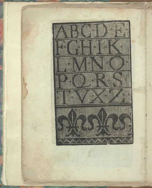
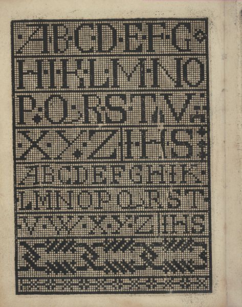
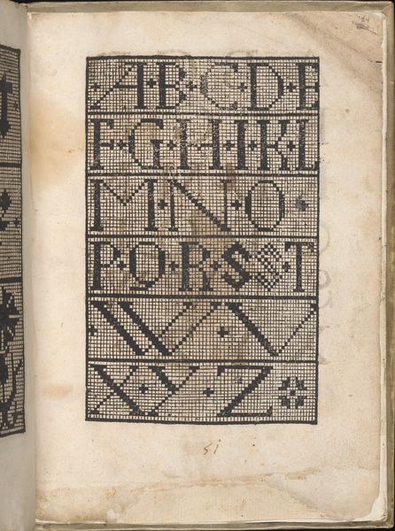
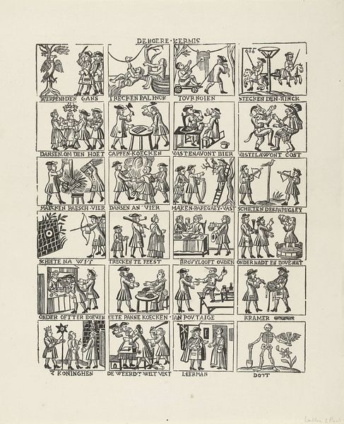
Curator: Here at the Rijksmuseum, we have an intriguing engraving from the early 19th century titled "Alfabet en cijfers," or "Alphabet and Numbers," created by Mindermann & Co. Editor: It’s delightful. It reminds me of samplers created to teach embroidery or needlepoint skills; this must have been a learning tool, or at least decorative, something hung in a child's room. Curator: Precisely. Notice how each letter is paired with an object? “A” accompanies a monkey, “B” a bear, “C” a citron… The artist uses straightforward imagery that aligns perfectly with academic art principles, placing emphasis on clarity and recognizable forms. Editor: What's compelling to me is the assumed cultural understanding embedded within these choices. The objects assigned to each letter tell us much about Dutch society during that era, providing clues to daily life and commonly held values. I’m particularly drawn to how these simple choices might inadvertently convey the politics of the period. Curator: Let’s look at the visual layout. Each letter and its corresponding image are neatly compartmentalized, reinforcing the clear structure of the alphabet itself. The style emphasizes precision, showcasing the engraver’s technical skill. The delicate lines give the print an almost fragile feel, indicative of a master printmaker. Editor: But that very compartmentalization also highlights an inherent structure, perhaps reflecting the social hierarchies of the 19th century? Each individual component is part of a larger system—alphabet, education, society—and this controlled organization visually represents order. Furthermore, the act of depicting numbers in Latin script reinforces historical ties to power, privilege, and Roman precedent. Curator: True, yet look closer. While ordered, the hand-drawn typeface possesses irregularities that indicate unique human artistry. We cannot ignore its deliberate placement and balanced composition. It all combines into a captivating unified visual experience. Editor: For me, it transcends mere aesthetics. This little print unveils so much regarding Dutch educational methods, childhood, and societal norms. It subtly compels viewers to decode meaning beyond form. Curator: And I would argue the very clarity of form and meticulous detail enhance, rather than obscure, our understanding of that context. Editor: Agreed. By merging these interpretations, we gain richer perspectives into historical understanding, whether through strict formal appreciation, or layered cultural and contextual evaluation.
Comments
No comments
Be the first to comment and join the conversation on the ultimate creative platform.
More like this