graphic-art, print, paper, typography, poster
#
graphic-art
# print
#
asian-art
#
paper
#
typography
#
poster
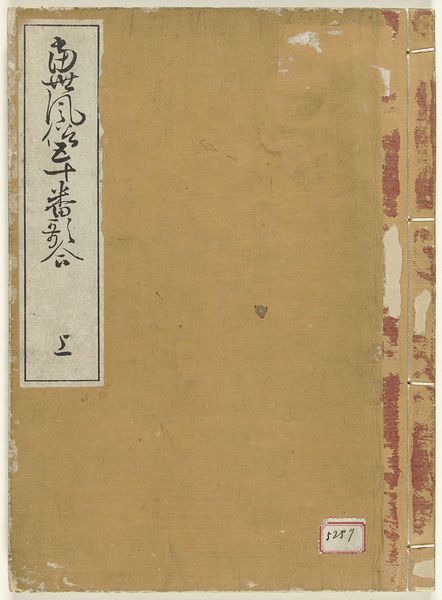
Dimensions: height 221 mm, width 149 mm
Copyright: Rijks Museum: Open Domain
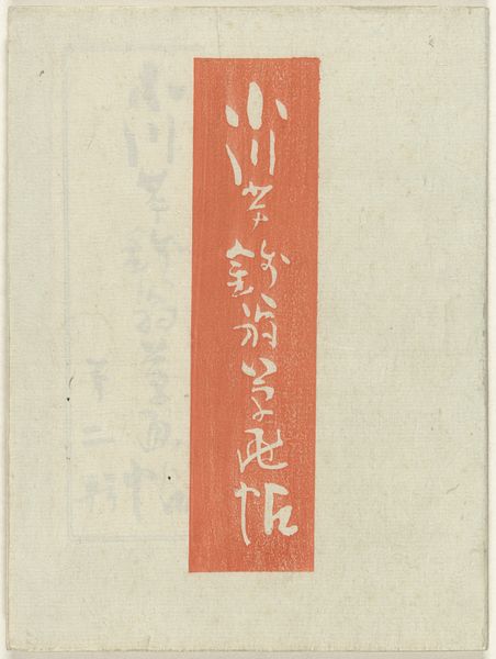
Nakazawa Hiromitsu made this cover for "Literatuur uit Waseda" with ink and color on paper. It is a muted palette, like an old photograph, with these amazing graphic elements in red and black that seem to float on a grey ground. The black rectangle to the left, the big, chunky characters read top to bottom, is so bold, yet feels delicate, almost like a collage. There is another set of characters to the right in a more complex arrangement, inside what seems to be the outline of a rubber stamp. The contrast between the two creates a compelling tension. It makes me think about Josef Albers’ “Homage to the Square”, and how he pursued a similar line of enquiry through abstraction. It is about process, really, and how one medium converses with another, like an ongoing game of telephone. The image seems to ask us: what is painting, what is a print, and what is the difference, anyway?
Comments
No comments
Be the first to comment and join the conversation on the ultimate creative platform.
More like this