graphic-art, print, typography, engraving
#
graphic-art
#
baroque
# print
#
typography
#
engraving
Dimensions: height 229 mm, width 133 mm
Copyright: Rijks Museum: Open Domain
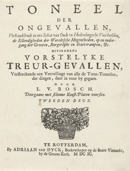
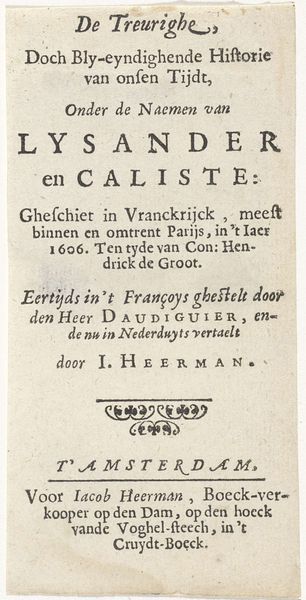
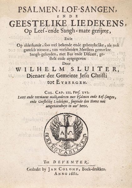
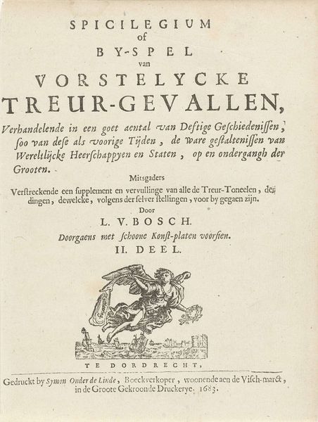
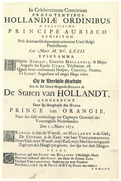
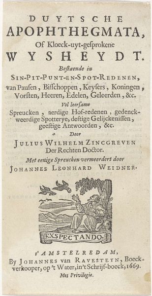
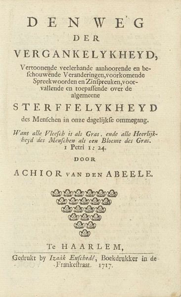
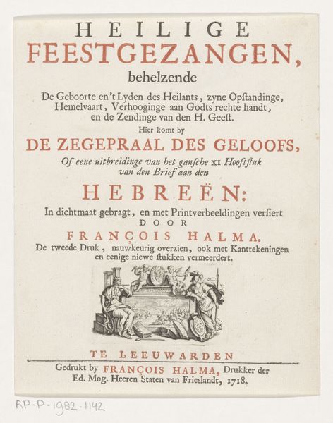
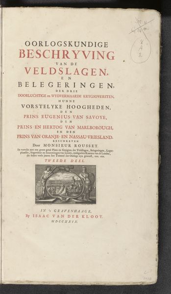
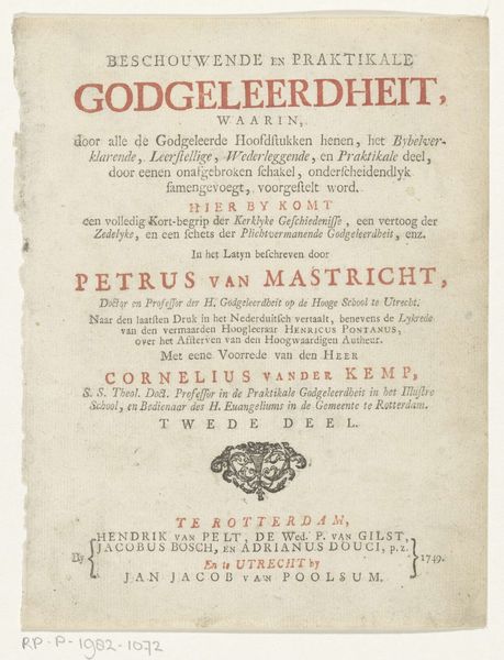
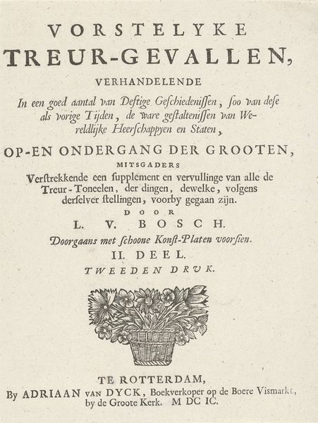
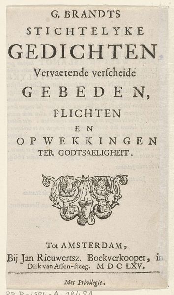
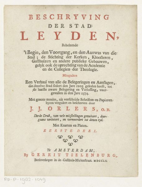
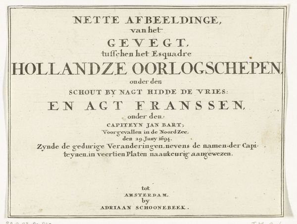
This is the title page for "De lydsaamheid en het gelove der heiligen," created in 1689 by Aert Pietersz. The page strikes one with its stark composition and contrasting textures, achieved through etching. Observe how the composition is divided into distinct textual blocks, each varying in font size and style, creating a visual hierarchy that guides the viewer's eye. The dense typography is relieved by the inclusion of a heraldic banner, yet even this is rendered in meticulous detail, highlighting the engraver's skill in capturing texture and form. The use of line and shape to frame and separate the text is notable. This formal arrangement serves not only to present information but also to evoke a sense of order amidst the complex religious and political debates of the time. Consider how the formal elements of typography, spatial arrangement, and symbolic imagery converge to create a powerful statement about faith, resilience, and the authority of the written word. The meticulous execution and thoughtful composition invite ongoing interpretation.
Comments
No comments
Be the first to comment and join the conversation on the ultimate creative platform.
