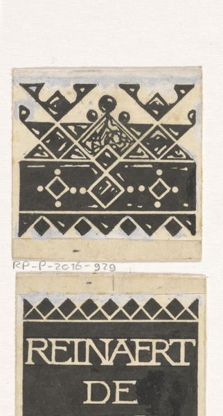
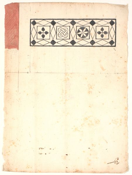
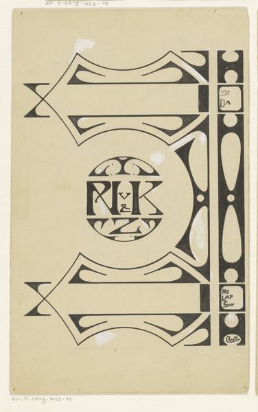
Ontwerp voor een boekrug voor: Stijn Streuvels, Reinaert de Vos, 1910 before 1910
0:00
0:00
drawing, graphic-art, paper, typography, ink
#
drawing
#
graphic-art
#
art-nouveau
#
paper
#
typography
#
ink
#
sketchbook drawing
Dimensions: height 201 mm, width 126 mm
Copyright: Rijks Museum: Open Domain
Editor: We're looking at a book spine design, "Ontwerp voor een boekrug voor: Stijn Streuvels, Reinaert de Vos, 1910," by Bernard Willem Wierink. It's an ink and paper drawing. I am struck by the rhythmic geometric patterns framing the author and title; it is so simple but bold. What do you see in this piece, with your expertise? Curator: The power of this work lies in its formalism. Note the strategic arrangement of shapes—triangles, dots, squares—each contributing to an overall visual harmony. The stark contrast between the black ink and the white paper emphasizes these forms. This push-pull dynamic is further reinforced by the rigid verticality of the spine, which is, interestingly, subverted by the organic looseness of the handwritten notes, no? Editor: Yes, I noticed those too. So, you're saying the beauty here resides in how the artist balances order and…well, maybe not chaos, but certainly informality? Curator: Precisely. And observe the typography; it is not merely functional, but integral to the aesthetic composition. The letterforms, enclosed within that strong vertical band, act as a visual anchor. The interplay of positive and negative space becomes paramount. How do you respond to the work's apparent functionality versus its purely aesthetic components? Editor: I hadn’t thought of it that way. I guess it challenges the traditional separation of art and design. The patterns, while decorative, are almost like a visual language in themselves. They feel very modern. Curator: Indeed. And within the historical context of the Arts and Crafts movement, one might observe an impulse to imbue everyday objects with artistic value, defying hierarchy between fine and applied art. This approach certainly reflects a similar sensibility. Editor: That’s a fascinating perspective. I had been so focused on the surface, but considering its purpose really deepens my understanding. Curator: As it should, art engages our mind in this fashion.
Comments
No comments
Be the first to comment and join the conversation on the ultimate creative platform.
More like this