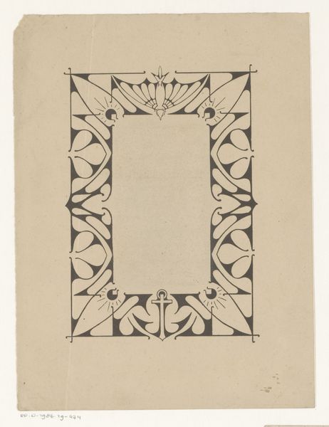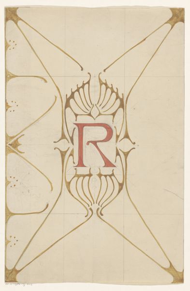
1898
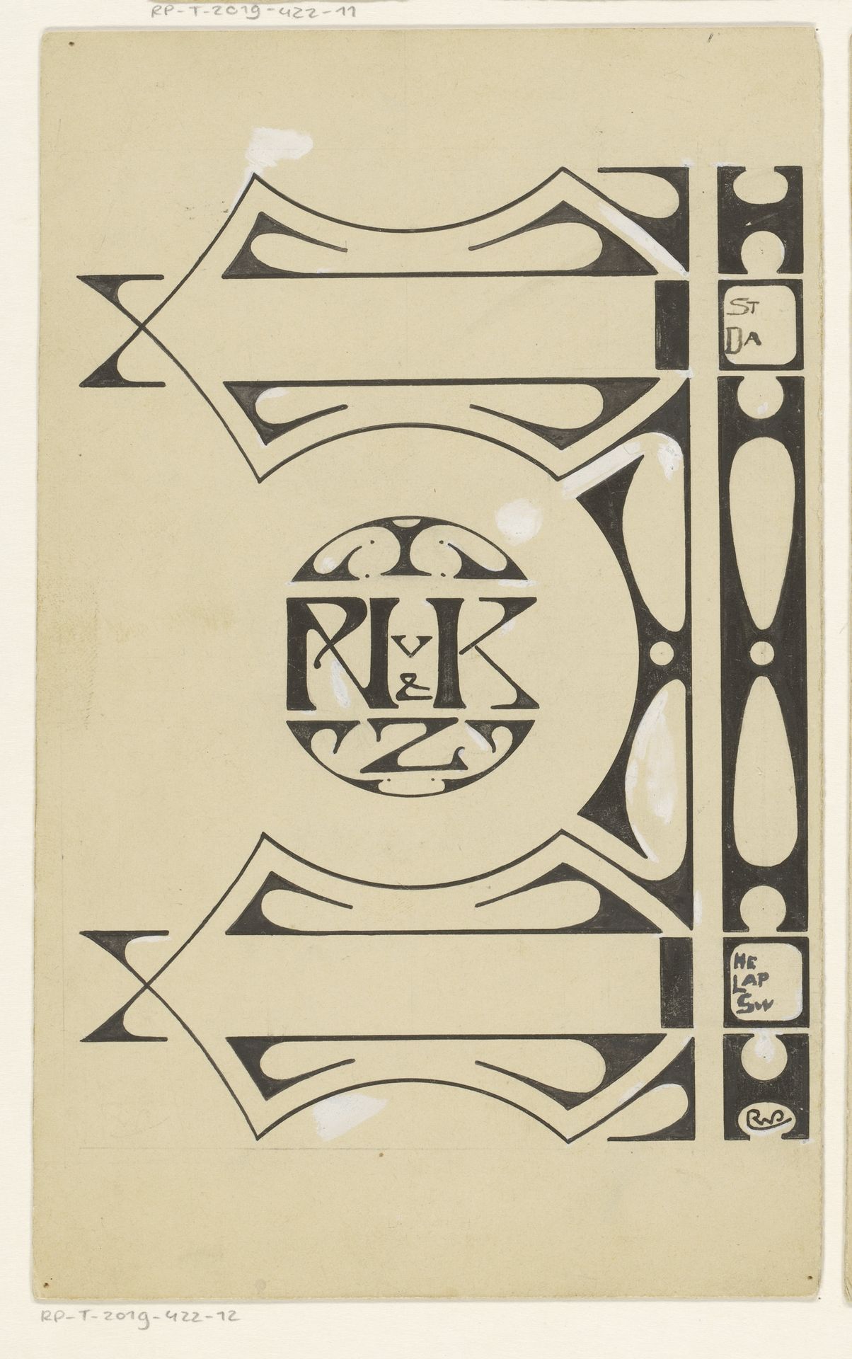
Bandontwerp voor de achterzijde van: Hélène Lapidoth-Swarth, Stille dalen, 1898
Listen to curator's interpretation
Curatorial notes
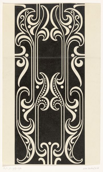
Reinier Willem Petrus de Vries created this design for the back cover of Hélène Lapidoth-Swarth’s book, "Stille dalen," around 1898, using pencil and ink. It's striking how De Vries uses these simple materials to create a design that speaks to the elegance of the Art Nouveau movement. The stark contrast of black ink on a light ground emphasizes the graphic quality of the design. It also cleverly integrates text and image: the author's initials R, K and Z, are encircled in the middle of the pattern, adding a layer of personal branding. Consider the process here. Each line, each curve, was carefully considered and meticulously drawn. The design reflects the influence of the Arts and Crafts movement, in its emphasis on handcraft and the integration of text with ornament. In its time, this would have been a relatively inexpensive method of achieving a very refined effect. The design highlights that even the most modest materials, when combined with skill, can be elevated to a work of art.