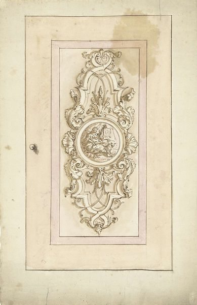
drawing, paper, fresco, ink, pencil
#
drawing
#
allegory
#
baroque
#
paper
#
fresco
#
ink
#
pencil
#
history-painting
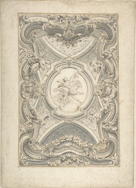
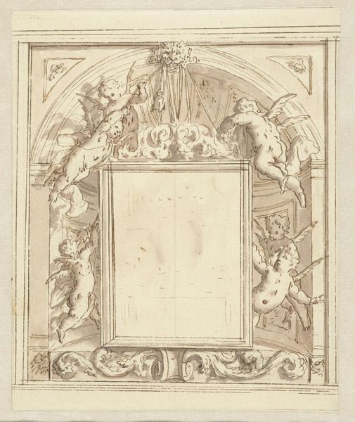
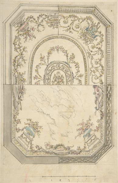
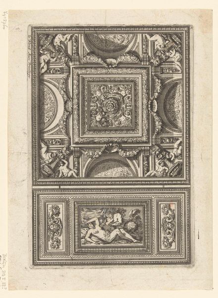
Dimensions: height 380 mm, width 246 mm
Copyright: Rijks Museum: Open Domain
Curator: Standing before us is a study attributed to Elias van Nijmegen, titled "Ontwerp voor een plafondschildering met apotheose van Liefde"—roughly, "Design for a Ceiling Painting with Apotheosis of Love." It was likely rendered between 1677 and 1755, using ink, pencil, and wash on paper. Editor: "Apotheosis of Love," eh? I see puffy cherubs wrestling, swirling clouds—very rococo Hallmark card, but with a slightly sinister edge in the draftsmanship, somehow. Feels a bit… unfinished and anxious? Curator: Note the octagonal central field dominated by celestial figures, framed by rectangular and square compartments filled with ornate, swirling patterns. The composition reveals a clear hierarchy and balance, essential to Baroque design principles. Look at the meticulous use of line, defining not only form but also texture, especially in the decorative borders. Editor: Yeah, all those swirls are doing something to my equilibrium! And those figures in the middle… they’re kind of crammed in there, aren't they? Almost like they’re falling instead of ascending. Are they supposed to be lovers? They seem a little tense for a love fest. I bet that ceiling was something else in the flesh. Curator: Such "tension" contributes to the artwork's dynamism. The upward thrust implied by the central scene is counteracted by the static geometry of the compartments, creating a visual push and pull. Semiotically, the cherubs serve as signifiers of divine love. Furthermore, their actions symbolize idealized notions about romantic relationships from the period. Editor: See, I just get this vague feeling of existential dread looking at it. Maybe love IS dread! It makes me feel so Baroque and forlorn, you know? Perhaps I'm seeing van Nijmegen’s ambivalence, knowing his work could be up there for centuries, staring down on generations with this somewhat awkward design. A lot of pressure if you ask me! Curator: An astute observation, one could suggest a more cynical deconstruction, viewing it as representative of the artificiality and constraints of the era's social conventions. Either way, it makes you wonder about perspective in this historical piece and our views today, doesn't it? Editor: Definitely, now when was the last time you were existential, professor? Ah! Here are our next guests now, goodbye folks.
Comments
No comments
Be the first to comment and join the conversation on the ultimate creative platform.
More like this