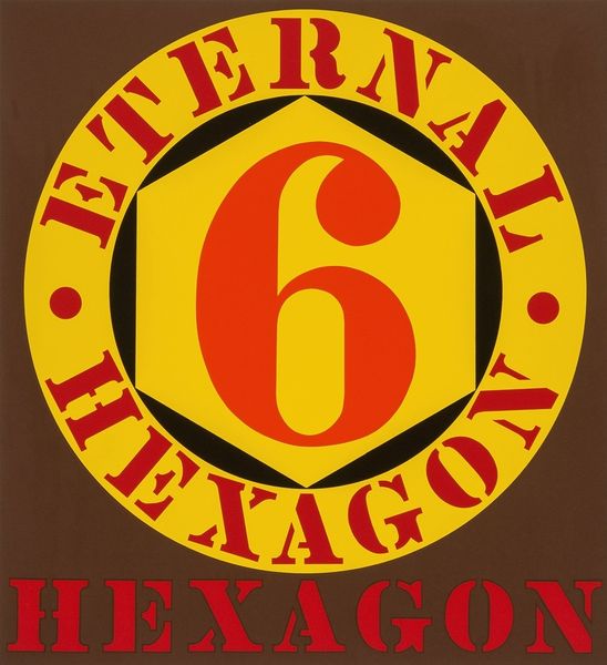
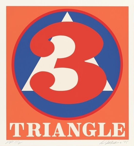
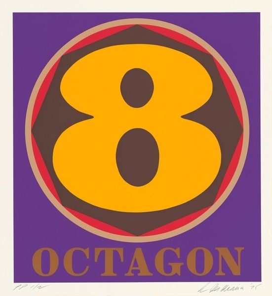
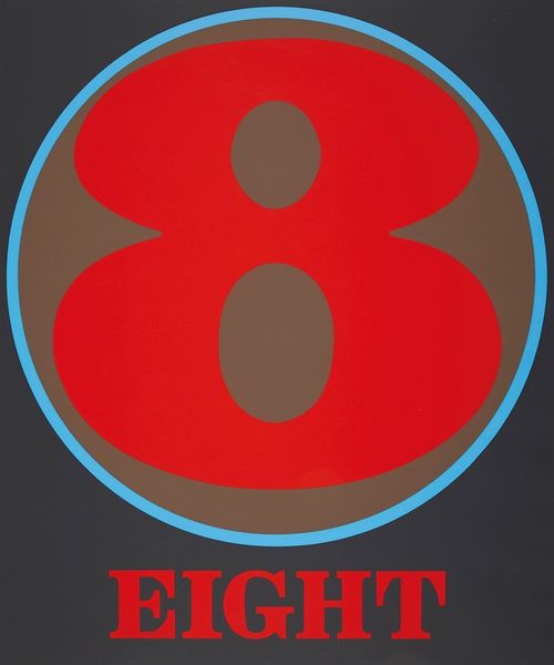
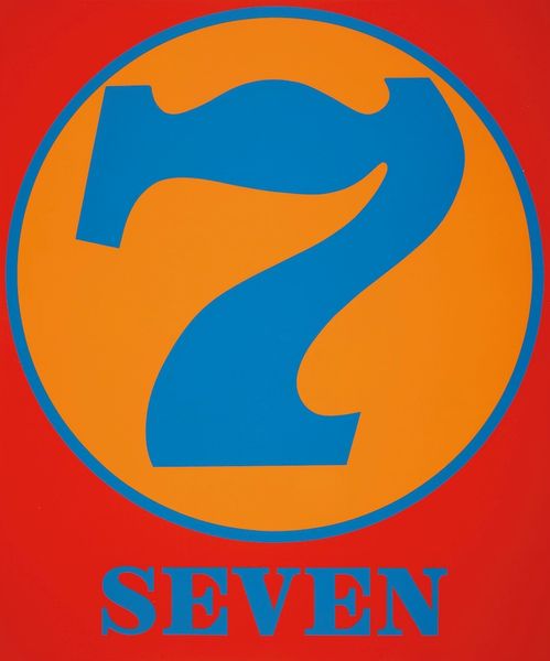
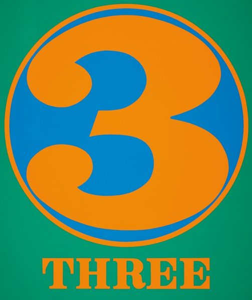
#
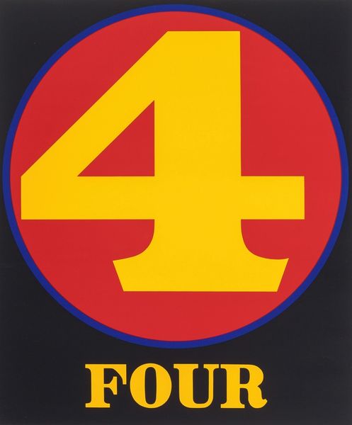
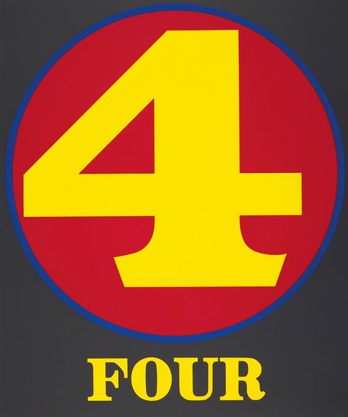
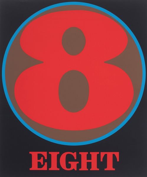
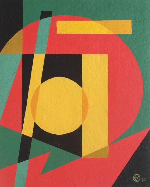
pop art-esque
#
popart
#
cold feature colours
# print
#
sweet colour type
#
pop art
#
bright colours popping
#
fully satured colours
#
yellow element
#
advertising for male clothe
#
artificial colours
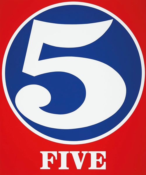
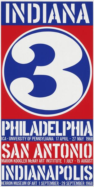
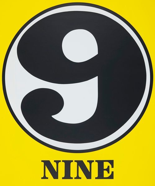
Dimensions: image: 60.96 x 56.2 cm (24 x 22 1/8 in.) sheet: 78.74 x 71.12 cm (31 x 28 in.)
Copyright: National Gallery of Art: CC0 1.0
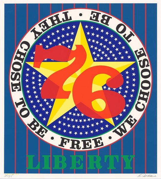
Curator: Let's turn our attention to Robert Indiana's print, "Pentagon," created in 1975. What's your immediate response to it? Editor: Bold. Primary colors slapped across the surface. A kind of graphic punchiness that feels both retro and oddly unsettling. Curator: I agree about the bold impact, but I see a precise, almost mathematical construction at play. Note the relationships between the circle, the contained pentagon shape, and the numeral "5". Each element exists within a very deliberate visual framework. Editor: But it's also charged with symbolism, wouldn’t you say? The pentagon itself, heavily laden with connotations of military power, contained within a seemingly benign circle. It's a tension. And the dominant numeral suggests, what, a countdown? Or perhaps quantity and accumulation of something within that pentagon? Curator: Precisely! The superimposition creates a dialectic—a formal play between geometric shapes and layered meanings. The flattening effect of the print medium intensifies the graphic quality while subtly denying depth. The choice of saturated colors amplifies this tension. Note how Indiana doesn't blend shades, preferring instead, solid blocks of color. Editor: Those vibrant, artificial colors… almost reminiscent of mid-century advertising. It echoes, perhaps ironically, the era of American optimism just before, perhaps, the realities and criticisms of the military-industrial complex gained more cultural prominence? The pentagon—and here I mean the shape, as much as the building—becomes a vessel of meanings, shifting in relation to context and time. Curator: Indeed. It would be easy to read this as pure Pop Art, playing on surface and immediate visual impact, but the interplay between form and symbol provides an unnerving depth. Indiana challenges us to decipher more than we might initially perceive. Editor: Yes, this isn’t just a catchy logo, even though it mimics one. There’s a sense of layered history embedded within that clean design, inviting multiple interpretations. It’s an artifact of a particularly charged moment. Curator: A perfect demonstration of the power of art to conceal while simultaneously revealing. Editor: Quite so. A deceptively simple construction, demanding sustained reflection.
Comments
No comments
Be the first to comment and join the conversation on the ultimate creative platform.
More like this