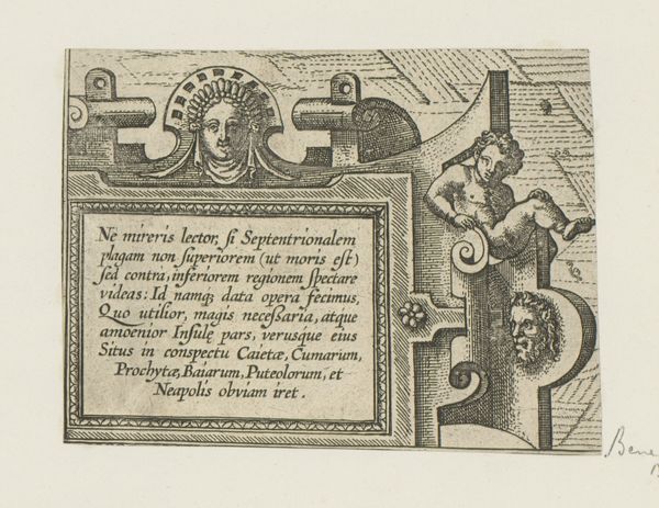
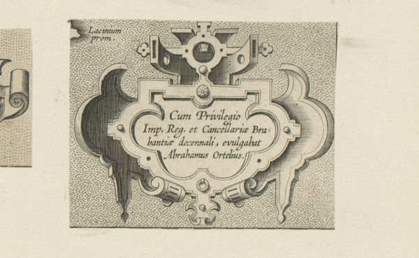
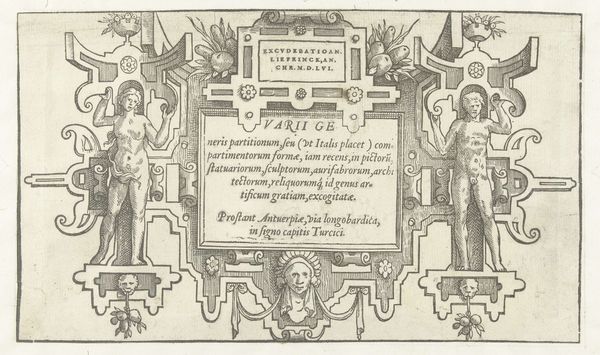
graphic-art, print, engraving
#
graphic-art
# print
#
11_renaissance
#
engraving
Dimensions: height 88 mm, width 133 mm
Copyright: Rijks Museum: Open Domain
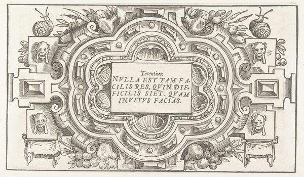
Editor: Here we have "Hoekcartouche met vrouwenmasker," made between 1598 and 1601 by an anonymous artist, an engraving printed on graphic art. The density of lines used to create this texture are mesmerizing, what can you tell me about how the engraving technique enhances the meaning here? Curator: The visual impact lies precisely in the contrasts achieved through the manipulation of line. Consider the stark differentiation between the densely hatched areas that establish depth and shadow, and the comparatively bare planes that constitute the cartouche’s literal surface. The formal opposition serves not merely as a decorative flourish but, theoretically speaking, directs the gaze and privileges certain textual elements over others within the composition. What do you observe in the contrast between the ornamentation and text? Editor: It looks like it is dividing itself geometrically. I mean the text has to be visible for one reason but the angel like person feels central. Do you get that as well? Curator: Indeed. The architectonic structuring of the cartouche effectively stages a hierarchy, framing the inscription. But let us not overlook the 'vrouwenmasker', that subtle but undeniably vital detail at the very apex. Observe how its centralized placement serves as a focal node, seemingly presiding over and imbuing the text below with an almost totemic significance. Note, as well, the visual counterpoint established through the stark geometries of the cartouche itself set against the organic curvature of the surrounding ornamentation. Is there anything particularly revealing about the relation of plane to curved surface? Editor: I see now. The contrast between the rigid cartouche and the fluid ornamentation makes me notice the lettering inside, which adds authority to what's written. Curator: Precisely. Such close attention to internal visual relationships begins to unravel the strategies of persuasion at work within the piece. This close reading reveals how what might seem a straightforward presentation is actually a site of nuanced visual rhetoric. Editor: That's a really insightful way to understand art; breaking down visual elements to analyze its underlying structure. Thanks.
Comments
No comments
Be the first to comment and join the conversation on the ultimate creative platform.
More like this