drawing, graphic-art, print, engraving
#
drawing
#
graphic-art
#
pen drawing
# print
#
form
#
11_renaissance
#
line
#
italian-renaissance
#
engraving
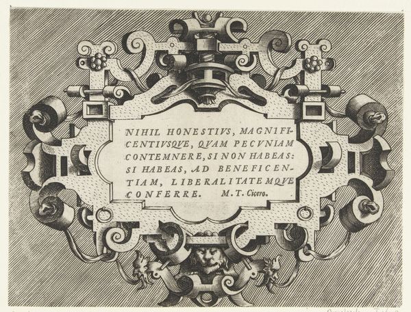
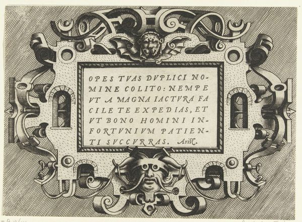
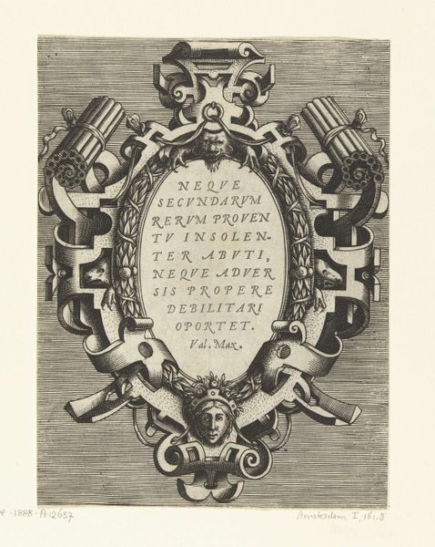
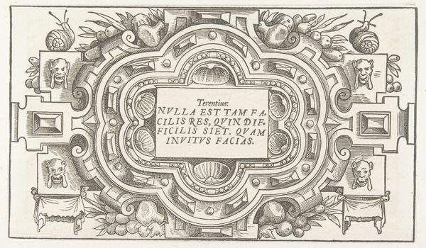
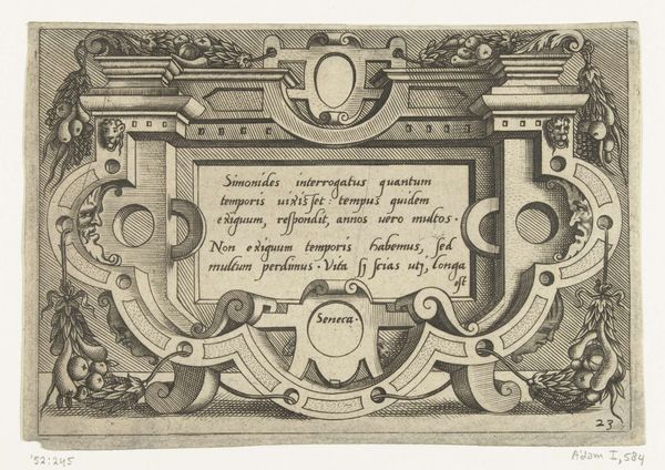
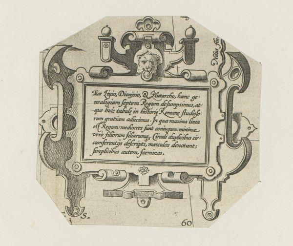
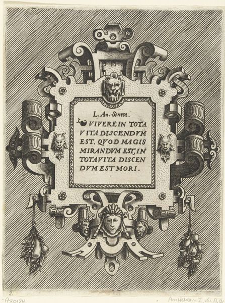
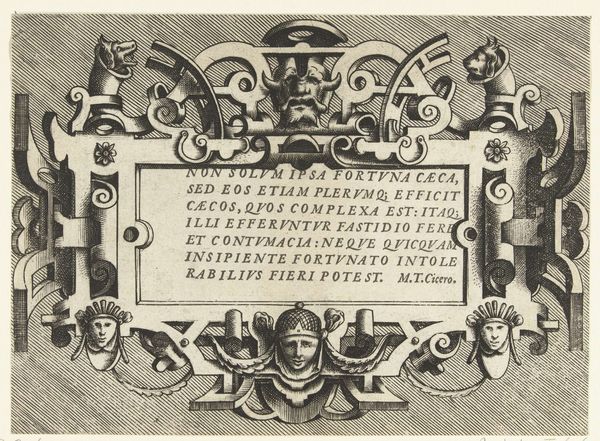
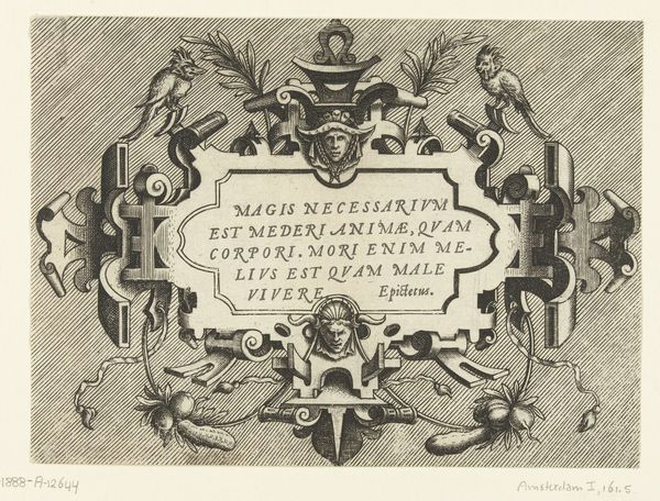
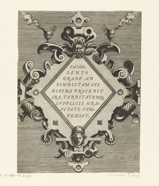
Dimensions: height 135 mm, width 180 mm
Copyright: Rijks Museum: Open Domain
Curator: At first glance, I see an intriguing play of symmetry and asymmetry, wouldn't you agree? The density of detail in the engraved lines creates a captivating visual rhythm. Editor: Indeed, the composition is certainly compelling, though I immediately find myself drawn to the evident labor and deliberate technique of engraving such intricate details in the early days of printmaking. This cartouche really foregrounds process. Curator: Precisely! It is a cartouche designed by Frans Huys around 1555, now held in the Rijksmuseum collection. Notice the precise rendering of the ornamental framework. It so effectively utilizes negative space that it could be described as pure form. The faces within the forms lend the image something of the grotesque, even! Editor: These aren’t just grotesque flourishes though. They remind me of the workshops where images were hammered into metal, ink painstakingly applied and wiped to produce an ideal impression; these images were made through very tactile processes by artisans who shaped designs through skilled work. What could be more human? Curator: A valuable point. And beyond the immediate surface, consider how the inscription becomes an integral compositional element. Its careful placement contributes to a unified field. What are your thoughts on its impact within the overall design? Editor: The textual element, with its Latin inscription, immediately reveals a clear functional goal here. The inscription gives authority, yet relies on print-making process for broader distribution. Curator: The inscription reminds us how interconnected Renaissance artistry was between design and philosophy, the aesthetic and intellectual, do you think? Editor: Exactly, the materiality of print in its very essence served intellectual life and wider access to otherwise inaccessible writings. Its texture, paper choice, ink--it all affects readership. Curator: Perhaps it's that balance of form and function that accounts for its enduring appeal even today? Editor: Perhaps, but what really moves me is the labor imbued within its form. What may appear to be just an elegant design has profound meaning regarding work, consumption, and class. Curator: That's a remarkable observation; it’s compelling to consider the human element at play even in seemingly geometric spaces. Editor: Precisely; and thinking materially truly expands how we appreciate a piece like this cartouche!
Comments
No comments
Be the first to comment and join the conversation on the ultimate creative platform.
More like this