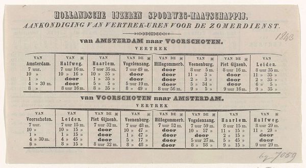
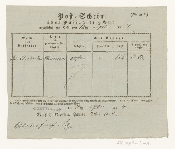
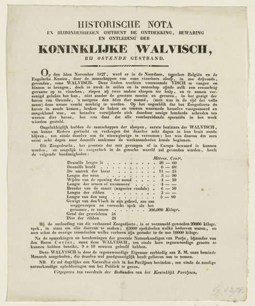
Hollandsche IJzeren Spoorweg-Maatschappij. Aankondiging van Vertrek-Uren, voor de winterdienst. Te beginnen primo november 1842 tot ultimo maart 1843 van Amsterdam naar Leiden 1842
0:00
0:00
drawing, lithograph, print, typography, poster
#
script typeface
#
drawing
#
script typography
#
hand-lettering
#
dutch-golden-age
#
lithograph
#
ship
# print
#
old engraving style
#
hand drawn type
#
landscape
#
hand lettering
#
typography
#
hand-drawn typeface
#
thick font
#
genre-painting
#
handwritten font
#
poster
#
historical font
Dimensions: height 473 mm, width 610 mm
Copyright: Rijks Museum: Open Domain
Curator: What an eye-catching piece! We're looking at a lithograph poster from 1842. It’s titled "Hollandsche IJzeren Spoorweg-Maatschappij. Aankondiging van Vertrek-Uren, voor de winterdienst. Te beginnen primo november 1842 tot ultimo maart 1843 van Amsterdam naar Leiden," which translates to a rather grand announcement of winter train schedules from Amsterdam to Leiden. It’s by Metzler & Basting. Editor: My immediate impression is that this has the spirit of a town crier for the industrial age. All that black typography shouts for attention, but it has such a confident, even elegant voice. It's announcing something important, maybe transformative. Curator: Absolutely! The bold typography conveys that very sense of progress and transformation. Notice the use of hand-drawn typefaces and elaborate script, particularly in the title—a fascinating combination of new technology and established artistic styles. The little train image at the top is so charming. It anchors the text. Editor: I see that train, and suddenly it clicks: this poster isn't just informing, it’s selling a new experience. Look at the detail—not just departure times but careful regulations around luggage. It paints this vivid picture of organised modern travel and the emergence of a rail travel culture! It is dictating certain expectations and limitations in this travel style! Curator: Precisely. Think about the intended audience. This poster represents an effort by the railway company to communicate a specific brand identity—reliability, efficiency, even a touch of luxury. And to control a user base that needs instruction. Also the way the text layout organizes a complex schedule reflects an attempt to make this novel mode of transportation more digestible for a public used to more traditional modes of transport. Editor: It's a fascinating object, and quite loaded. This piece acts as a cultural artifact of emerging ideas and values attached to technological advancement, like the railway. Curator: Agreed. Examining a piece like this lets us witness a pivotal moment when technological change wasn't just about machinery but a radical reshaping of everyday life. Editor: For me, seeing how graphic design becomes a tool of not only informing the public, but of persuasion for a culture of technological expansion, brings its symbolic undercurrents into focus.
Comments
No comments
Be the first to comment and join the conversation on the ultimate creative platform.
More like this