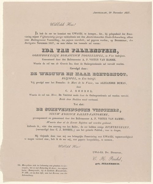
Programma van de viering van het 40-jarig regeringsjubileum van Willem III, koning der Nederlanden, te Hilversum op 13 mei 1889 1889 - 1891
0:00
0:00
anonymous
Rijksmuseum
print, typography, poster
#
dutch-golden-age
# print
#
typography
#
poster
Dimensions: height 299 mm, width 215 mm
Copyright: Rijks Museum: Open Domain
Editor: This is a poster, a printed program actually, for the celebration of King Willem III’s 40th Jubilee in Hilversum, dated 1889-1891. It looks like it was printed using typography. It feels quite austere, but ordered, even rigid in its layout. What’s your take? Curator: The program's structure dictates its visual appeal. Observe the typographic hierarchy, for instance: larger fonts command attention for key details like the event's title and the King's name. Then, consider the sequential layout. Note how the composition adheres to a linear format. It carefully organises a sequence of events planned for the celebration. Do you notice how the typography does the work of imagery here? Editor: I see what you mean about the linear progression and the typography as image. Is the choice of typeface significant? Curator: Absolutely. The typeface contributes significantly to the poster's overall character, providing texture through different weights. The clean, sans-serif fonts create a sense of order and legibility, essential for conveying information clearly. This conscious choice enhances the overall formal structure. Consider its systematic nature: The formal elements work together to portray a clear program. It evokes the orderly nature of official functions. What do you think about that tension? Editor: I see that now. It's not just a list; it's constructed with deliberate attention to detail. I initially overlooked the subtle textures created by the varied font weights. It’s like they wanted to make something memorable yet functional! I hadn’t thought about that before. Curator: Precisely! Now you’re attuned to the nuanced relationship between function and form. Keep exploring and analyzing.
Comments
No comments
Be the first to comment and join the conversation on the ultimate creative platform.
More like this