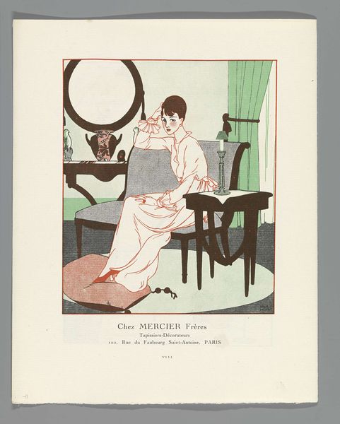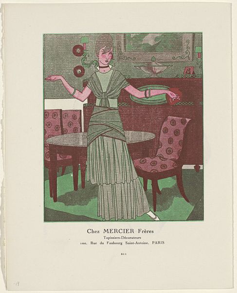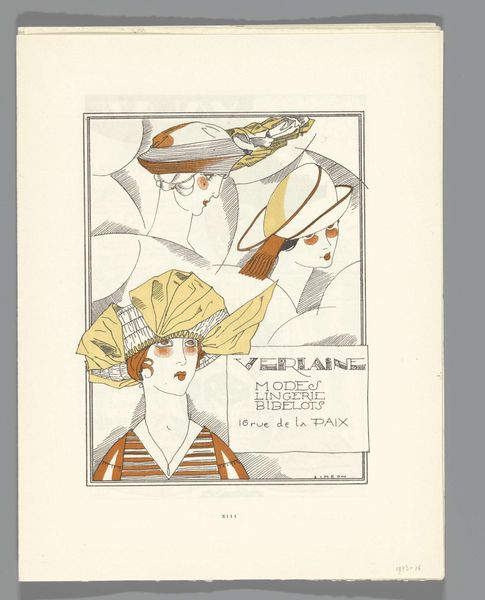
Gazette du Bon Ton, 1920 - No. 7, p. LIII: Les modes, les lingeries chez Verlaine 1920
graphic-art, print
portrait
graphic-art
art-nouveau
historical fashion
Dimensions: height 185 mm, width 245 mm
Copyright: Rijks Museum: Open Domain
Fernand Siméon made this cover for the Gazette du Bon Ton in 1920 using a subdued palette of browns, blacks, and creams, relying on line work and blocks of color to create a sense of streamlined elegance. It’s all about seeing and being seen, isn't it? The flat blocks of color create a grounding background, against which the linework really pops. Notice the details of the woman’s hat and hair—they’re so precise. And that pop of pink on the makeup compact she’s holding is just so perfectly placed. The eye is drawn to the geometry of her hat and the implied luxury of her face and possessions. It reminds me a bit of Erté, another artist working in fashion illustration at the time, but Siméon has a slightly more playful and pared-down approach. Ultimately, it's that economy of means and the clear statement that make it so compelling. We can look at this image now and still see how much is being communicated.
Comments
No comments
Be the first to comment and join the conversation on the ultimate creative platform.
