Dimensions: 13 11/16 x 9 5/8 in. (34.7 x 24.4 cm)
Copyright: Public Domain
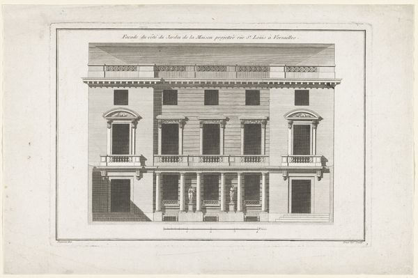
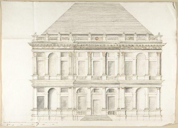
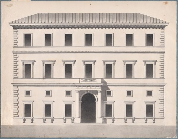
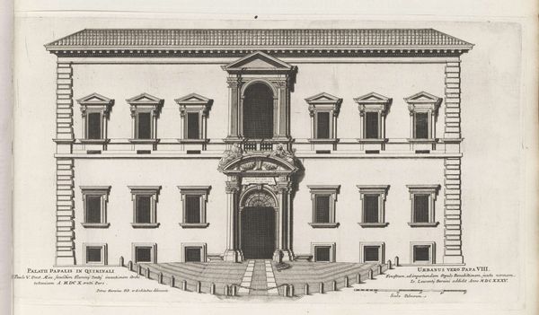
Curator: What immediately strikes me is the austere beauty of the architecture. Editor: Indeed. We're looking at "Design for a Palace Façade," a drawing attributed to Carl Hårleman, likely created sometime between 1720 and 1753. The rendering is currently held at the Metropolitan Museum of Art. Curator: Hårleman, of course, was instrumental in bringing Neoclassical ideals to Sweden. It’s evident here. It’s all about the symmetry, the rigid geometry... even the palette, restricted as it is, evokes a sense of rationality. What statement do you think this architectural drawing makes, though? What kind of social space does the design produce, and for whom? Editor: For me, the essence resides within the masterful control of line and form. Consider how the arches on the ground level yield to the square windows, and then ultimately to the rhythm of evenly spaced columns and the statues on the roofline. It generates this captivating play of solid and void, a tension held in perfect equipoise. Curator: Absolutely. I read it as embodying Enlightenment ideals, where civic structure physically embodies ideas of control and authority. Notice the figures poised above the structure; their allegorical quality indicates an intention to convey ideals of justice, law, and perhaps liberty. Editor: The formal execution is breathtaking, though! Look how Hårleman conveys depth through a subtle graduation in shading; the geometry alone speaks volumes. And even though we speak of austerity, consider how surface and depth play across each other – creating complex and intriguing surfaces. Curator: I find myself imagining the intended inhabitant of this palace. Given Hårleman’s context, a design like this reinforces the stratified hierarchies of the aristocracy. It's less about the aesthetic purity and more about solidifying structures of class, status, and privilege. I cannot detach it from the elitism it seeks to immortalize in stone. Editor: I see your point, and acknowledge its valid place in the broader understanding. Yet, the visual structure retains its power. We witness this play between balance and surface articulation. To me, Hårleman leaves us with a potent articulation of aesthetic discipline that continues to impact design and visuality today. Curator: I suppose grappling with that tension is precisely the point. Thank you, that really broadened my understanding of the design! Editor: My pleasure; indeed it allows for deeper aesthetic enjoyment by better understanding structure!
Comments
No comments
Be the first to comment and join the conversation on the ultimate creative platform.
More like this