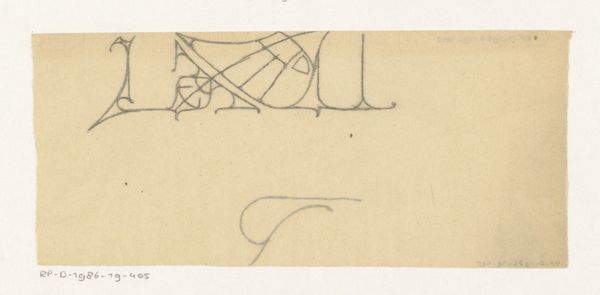
drawing, paper, ink
drawing
art-nouveau
paper
form
ink
geometric
line
Dimensions: height 126 mm, width 227 mm
Copyright: Rijks Museum: Open Domain
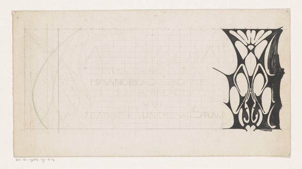
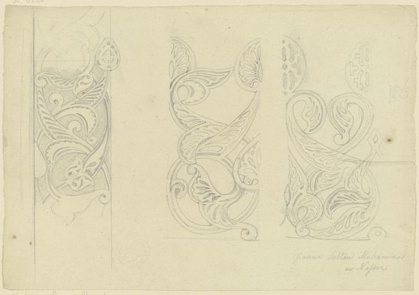
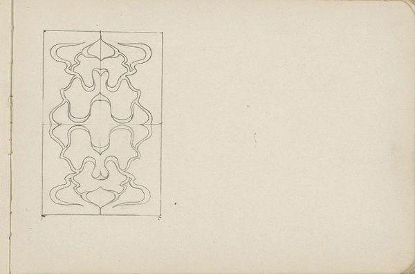
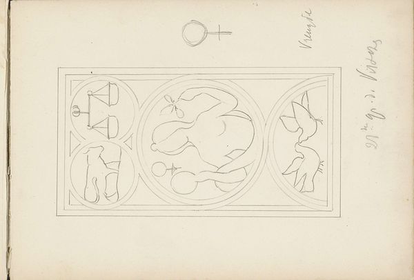
Curator: Looking at this piece, I immediately feel drawn into its graphic boldness, it’s like peering into an archaic alphabet, wouldn't you agree? Editor: Precisely. We are looking at "Ontwerpen voor een titelhoofd," created around 1901 by Reinier Willem Petrus de Vries. Executed in ink on paper, this drawing presents two unique designs that delve into the intersection of form and Art Nouveau aesthetics. It's an interesting example of using geometry as a visual object. Curator: Geometry gets such a bad rep sometimes. The artist just wants to make it pretty... The duality is really working for me. Two slightly varied designs; one strict and ordered, one wilder and a little bit more decorative... Editor: These designs, although static, invoke the feeling of growth or even germination with their rounded abstract shapes pushing up from a ground line. They speak to something primal within us. Perhaps the dawn of symbolic communication. What do you make of their near-symmetry? Curator: I think the symmetry creates this subconscious comfort while the asymmetry is an invitation into what could come. It gives it a "to be continued" kind of vibe that’s really magnetic! I'm seeing a grounded, but spirited energy. It reminds me of standing in front of an old tree feeling the tug of gravity while watching the breeze caress the highest leaves... I see strength reaching towards grace. Editor: Indeed. The play between controlled line work and organic abstraction underscores the tension inherent in Art Nouveau itself, the balance between industrial production and handcrafted uniqueness. The contrast creates a feeling of being pulled simultaneously backwards into older more romantic symbolism and forward into something wholly new. Curator: A portal through art, I’d say! Editor: Absolutely, it makes one consider the weight and intention behind the design process... Curator: You're so right, I can see this on anything from a book cover to maybe even repurposed as a brand logo today... The lines might be old, but its design is, essentially, timeless. Editor: And therein lies its continued relevance for a modern audience. The language of symbolic communication endures.
Comments
No comments
Be the first to comment and join the conversation on the ultimate creative platform.