drawing, graphic-art, ink, pen
#
drawing
#
graphic-art
#
toned paper
#
art-nouveau
#
ink
#
pen-ink sketch
#
ink colored
#
sketchbook drawing
#
pen
#
decorative-art
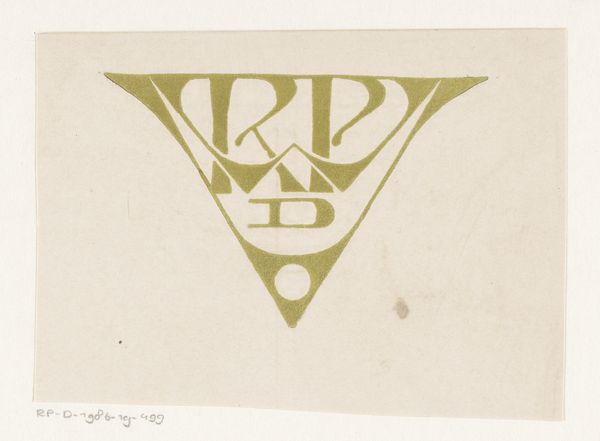
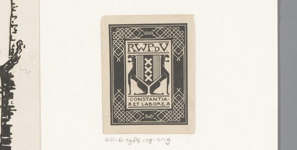
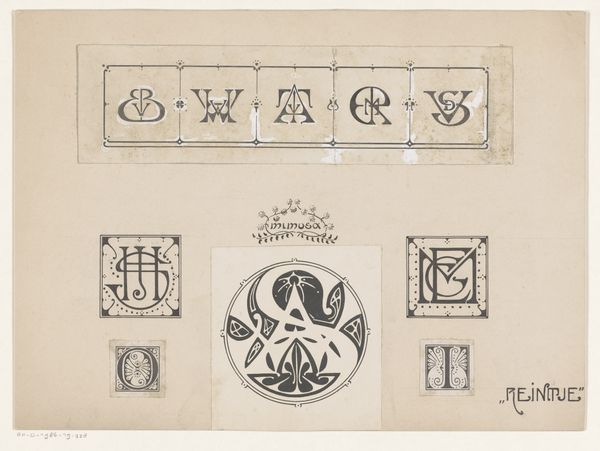
Dimensions: height 42 mm, width 41 mm
Copyright: Rijks Museum: Open Domain
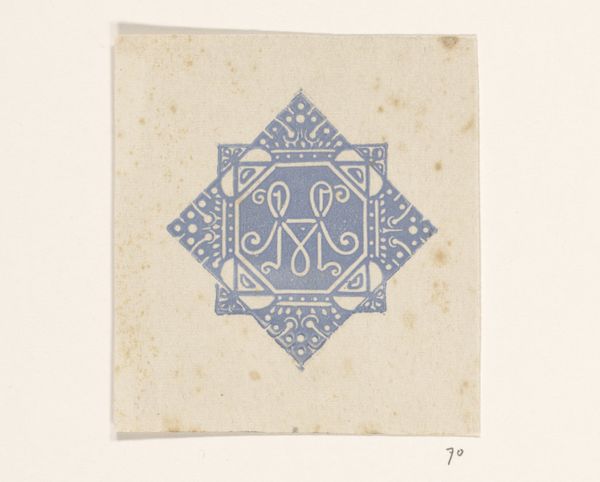
This is a small vignette made by Reinier Willem Petrus de Vries, likely a print, for W. Voet en Zonen in Haarlem. It's all about the black and white, isn't it? The contrast pops, giving it a clean, graphic punch. It looks really precise, but there’s a hand-done quality to the lines, a kind of playful wonkiness, which I love. It’s like the artist is embracing the little imperfections that come with the process, making it feel super personal. I’m drawn to how the design is so dense, almost like a little maze, yet the text and the imagery are perfectly balanced. The lettering is super clear, but then you get lost in the swirls and details of the decoration. It’s like, are you supposed to read it, or just look at it? That tension makes it so engaging! This piece reminds me of some of the works of the graphic artist M.C. Escher, playing with perspective and space in similar ways. Art is always echoing, riffing off each other, across time.
Comments
No comments
Be the first to comment and join the conversation on the ultimate creative platform.
More like this