1884 - 1952
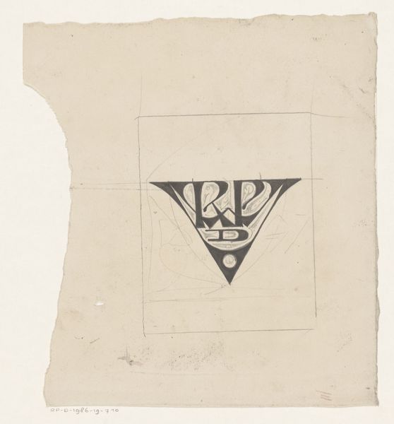
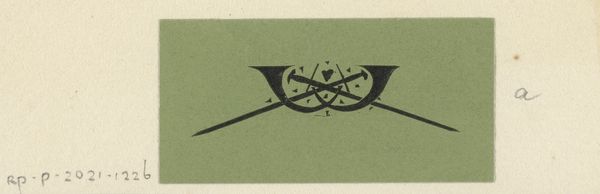
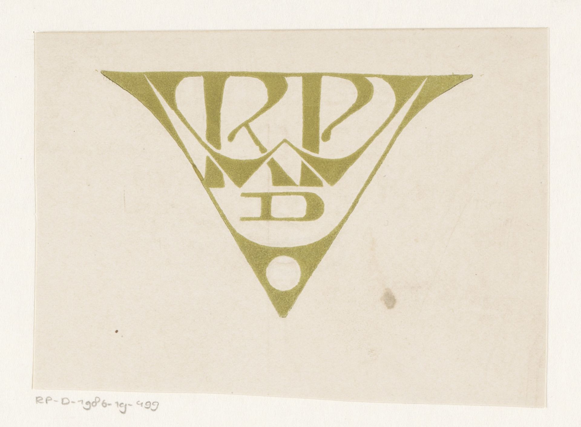
Vignet met monogram RWPdV
Listen to curator's interpretation
Curatorial notes
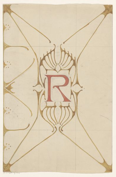
Reinier Willem Petrus de Vries made this monogram with what looks like pencil and ink. The mark-making is so clean and confident that you can tell it comes from someone who’s practiced a lot. There’s something so cool about the flat, almost metallic looking, olive colour that fills the spaces between the letters. It’s not trying to be realistic or illusionistic; it’s just colour doing its thing. The texture of the paper peeks through, which gives it a kind of honesty. Look at the way the letters are interlaced, they almost make a kind of maze. It’s like a puzzle that you solve with your eyes. I think a detail like the circle at the bottom is just perfect, like a full stop at the end of a good sentence. This piece reminds me a little of Hilma af Klint’s work. Both artists were interested in symbols and geometry. It shows how different artists can be in conversation with each other, even across time. Art is like that, an ongoing exploration. It's never really finished, is it?