drawing, paper, ink
#
drawing
#
art-nouveau
#
paper
#
form
#
ink
#
geometric
#
abstraction
#
line
#
decorative-art
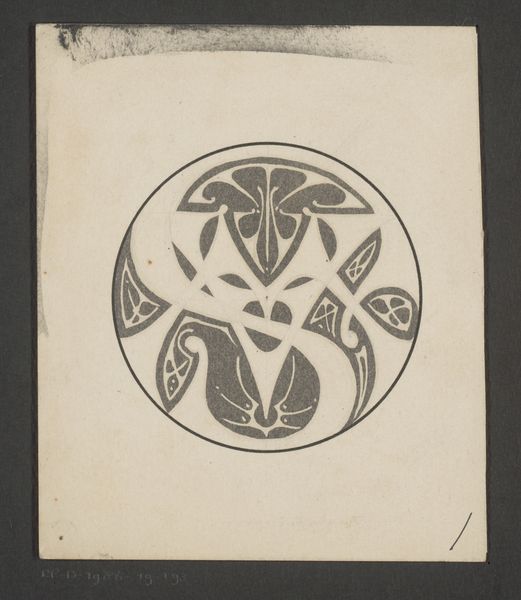
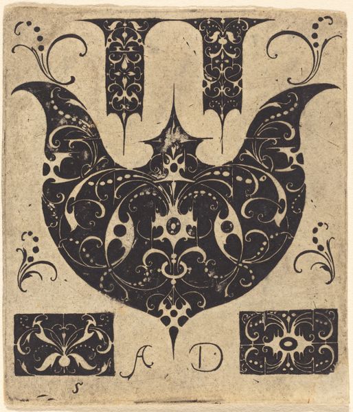
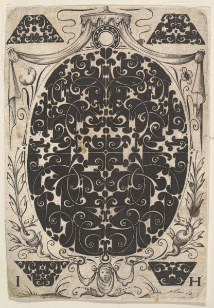
Dimensions: height 88 mm, width 85 mm
Copyright: Rijks Museum: Open Domain
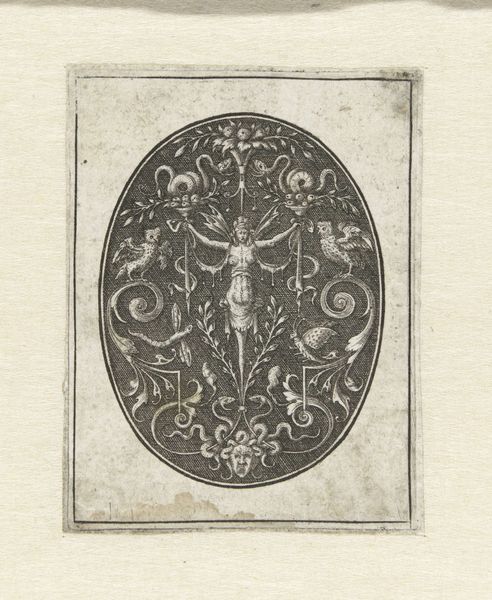
This is Reinier Willem Petrus de Vries' design for a monogram, likely made with ink on paper. It’s such a cool example of how artists work through ideas. You can see the sureness of the lines, how the black and white play together to create this striking image. I’m really drawn to how the artist uses black to define these elegant, curving shapes. There's a real understanding of negative space here, how the absence of ink can be just as powerful as the ink itself. It makes me think about the materiality of art, the physical act of applying ink to paper, and how that simple act can produce something so visually interesting. There's a certain rhythm to the design, like the rise and fall of a musical phrase. This piece reminds me a little of Aubrey Beardsley, but with a more graphic edge. It's a reminder that art is a conversation, artists responding to and building upon each other's ideas across time. It's a great example of the power of simplicity and the beauty of the black and white.
Comments
No comments
Be the first to comment and join the conversation on the ultimate creative platform.
More like this