![Untitled [plate VIII] by Joan Miró](/_next/image?url=https%3A%2F%2Fd2w8kbdekdi1gv.cloudfront.net%2FeyJidWNrZXQiOiAiYXJ0ZXJhLWltYWdlcy1idWNrZXQiLCAia2V5IjogImFydHdvcmtzLzIxYjg1NjFjLTkzYTYtNGY2MC1iMzY4LTE3NmU0ODYyZDVkYS8yMWI4NTYxYy05M2E2LTRmNjAtYjM2OC0xNzZlNDg2MmQ1ZGFfZnVsbC5qcGciLCAiZWRpdHMiOiB7InJlc2l6ZSI6IHsid2lkdGgiOiAxOTIwLCAiaGVpZ2h0IjogMTkyMCwgImZpdCI6ICJpbnNpZGUifX19&w=1080&q=75)
#
photo of handprinted image
#
childish illustration
#
cartoon like
#
pastel soft colours
#
ink paper printed
# print
#
pastel colours
#
watercolour illustration
#
cartoon style
#
remaining negative space
#
watercolor
Copyright: National Gallery of Art: CC0 1.0
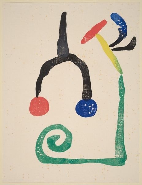
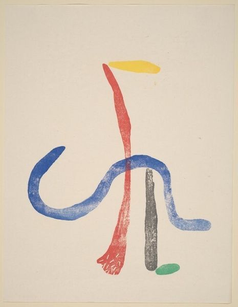
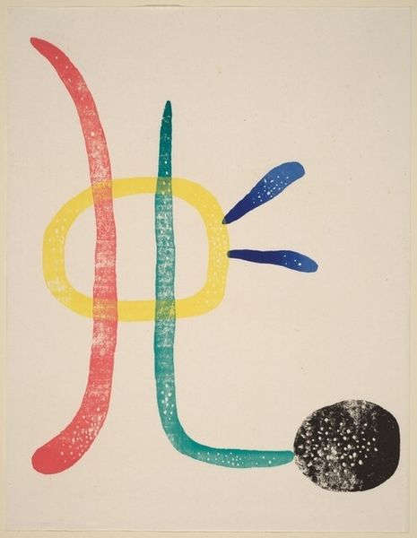
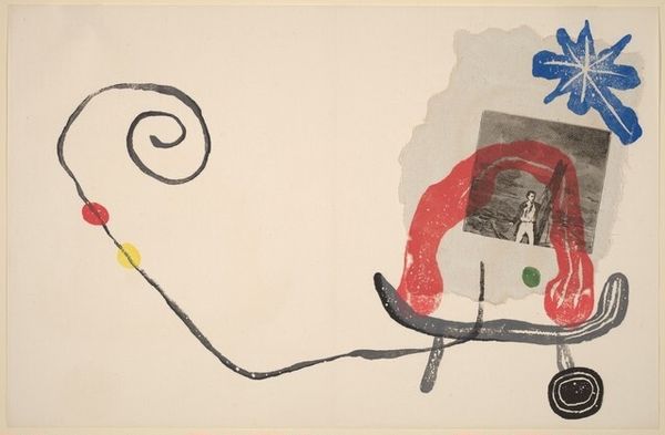
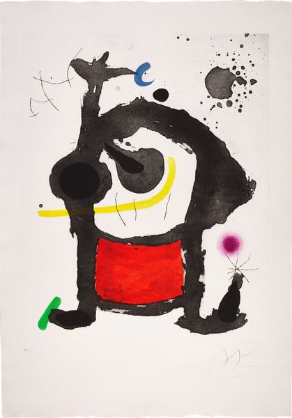
Joan Miró made this untitled print using lithography, a process of printing from a flat stone or metal plate. The colors are simple – blacks, blues, and one bold red – and the shapes feel both deliberate and totally off-the-cuff, like a doodle you might find in the margins of a notebook. I love the way the black ink isn’t uniform, you can almost feel the texture of the stone, with its tiny imperfections. Take a look at the blob on the left, it’s like a heavy weight pulling the whole composition off balance. Then there’s that bright red shape hanging like a plumb bob off the curve of the dark form. It’s like he’s showing us that art doesn’t have to be perfect to be powerful, it can be playful and imperfect, just like life. Thinking about other artists, Miró reminds me a little of Paul Klee – both of them playing with these simplified forms that suggest so much more than they actually depict.
Comments
No comments
Be the first to comment and join the conversation on the ultimate creative platform.
More like this