![Untitled [plate LXXVII] by Joan Miró](/_next/image?url=https%3A%2F%2Fd2w8kbdekdi1gv.cloudfront.net%2FeyJidWNrZXQiOiAiYXJ0ZXJhLWltYWdlcy1idWNrZXQiLCAia2V5IjogImFydHdvcmtzLzBjMWI4OGFkLTRlZDAtNDU4YS04YTRlLTQwZjM4ZWI1ZjQ0ZS8wYzFiODhhZC00ZWQwLTQ1OGEtOGE0ZS00MGYzOGViNWY0NGVfZnVsbC5qcGciLCAiZWRpdHMiOiB7InJlc2l6ZSI6IHsid2lkdGgiOiAxOTIwLCAiaGVpZ2h0IjogMTkyMCwgImZpdCI6ICJpbnNpZGUifX19&w=1080&q=75)
#
photo of handprinted image
#
childish illustration
#
pastel soft colours
#
ink paper printed
# print
#
pastel colours
#
soft and bright colour
#
watercolour bleed
#
watercolour illustration
#
a lot negative space
#
watercolor
Copyright: National Gallery of Art: CC0 1.0
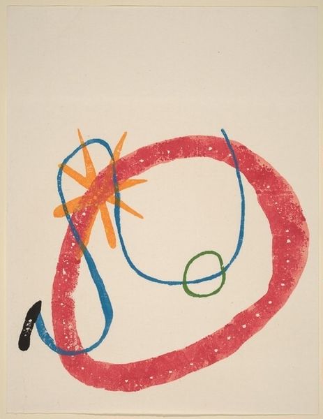
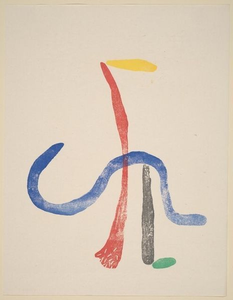
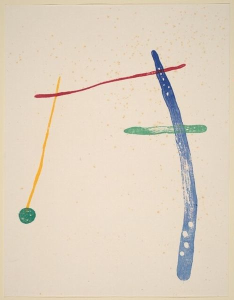
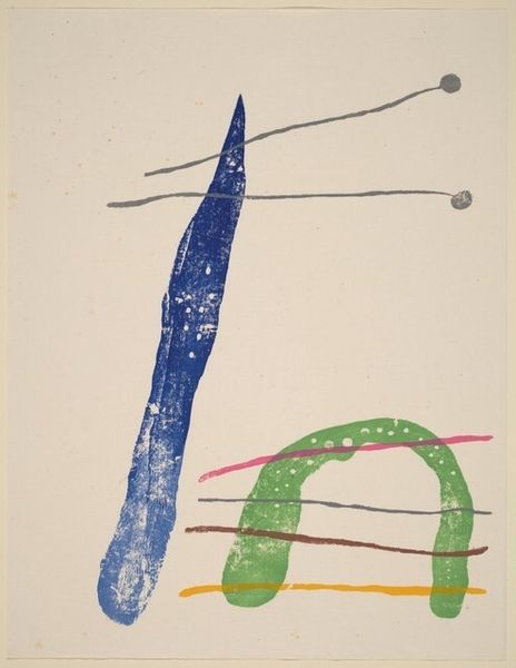
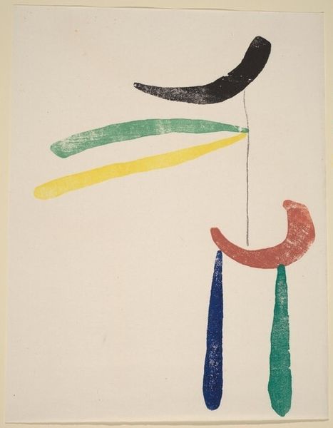
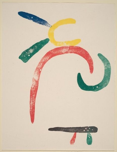
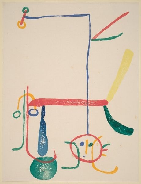
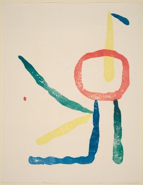
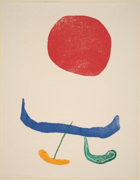
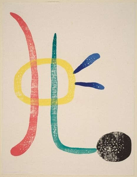
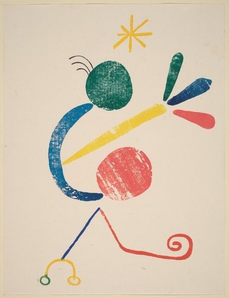
Editor: This is Joan Miró's "Untitled [plate LXXVII]" from 1958, a print on paper. The use of such simple shapes is really interesting; it feels both primal and playful to me. How would you interpret this work? Curator: Focusing solely on its visual structure, the composition employs a significant amount of negative space, which serves to isolate and thereby accentuate the sparse arrangement of lines and shapes. The chromatic selection—primary hues punctuated by secondary blends—demands close inspection. What effect do you believe that interplay of color and form creates? Editor: It feels almost like a code...simple building blocks trying to express something more complex than the marks suggest, I suppose. How much does the print medium affect its meaning? Curator: The inherent qualities of the print medium – its capacity for reproducibility, its texture, its engagement with the surface – materially inform our reading. The flatness of the printed image, the intentionality behind each delineated form, contributes to the artwork's visual semantics. Notice how the lack of depth and perspective heightens the symbolic value of each element. Editor: So it’s the very limitations of the print that give it power? Curator: Precisely. The restrictions imposed by the medium foreground the artist’s choices in terms of composition and color. It calls attention to the aesthetic decisions. This distilled approach—reducing imagery to essential elements—reflects Miró's unique pictorial language. Editor: This piece feels deceptively simple but your perspective illuminates such intention and purpose. Curator: Indeed. By attending to these intrinsic elements, we uncover the complexities woven into even the simplest of forms.
Comments
No comments
Be the first to comment and join the conversation on the ultimate creative platform.
More like this